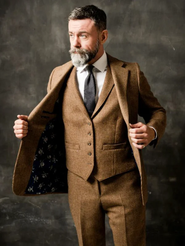
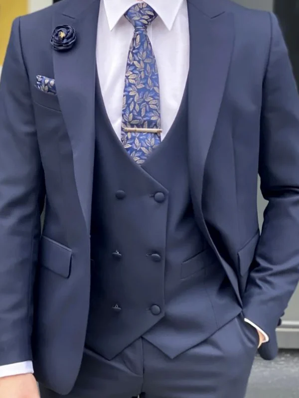
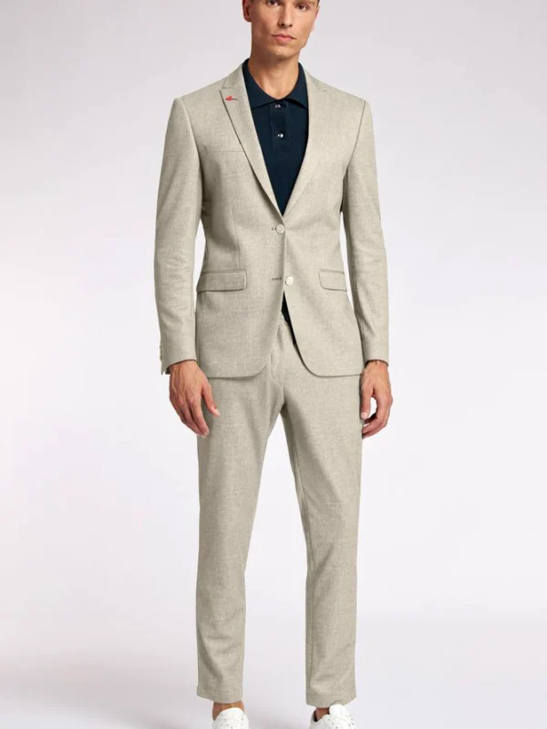
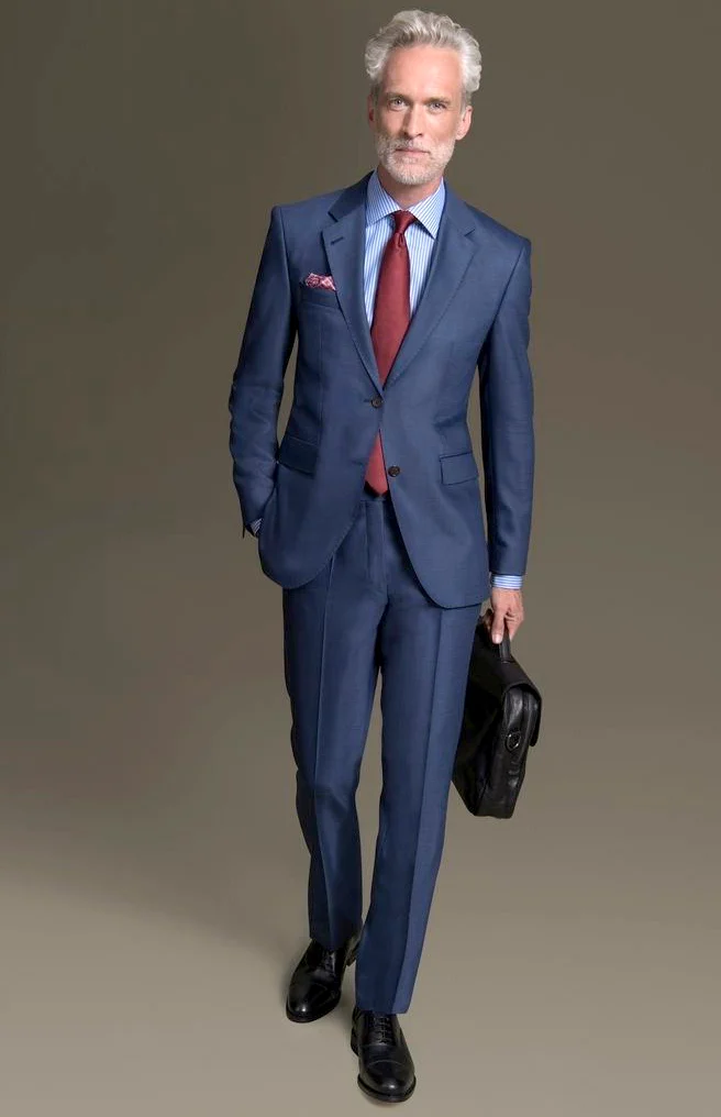
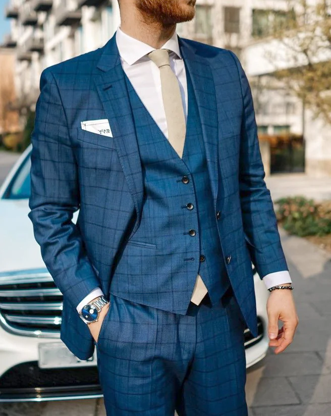
Choose a shirt for a blue suit by keeping the existing jacket consistent first. These references show different relationships: pale blue beside darker navy, visible shirt stripes with a red tie, and white collar above a blue waistcoat. A grey combination with a black turtleneck deliberately provides another neck solution. Compare the shirt area you want visible between face and jacket initially. There is no need to buy an entire new suit or adopt every accessory in one picture to make that individual decision clearly.
Choose a shirt for a blue suit through preferred brightness
Place an actual white shirt and a pale blue one beside your jacket. Try each in turn and view the combination under similar light. Should the neck area stand out more brightly or remain closer to jacket colour? The darker complete reference shows pale blue with a blue tie, while the waistcoat-focused view places white beside stronger blue. These are different jobs for the same visible location. Decide your preferred separation before introducing a particular tie colour that may otherwise dominate the comparison.
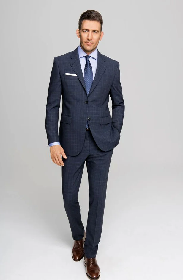
Do not compare two shirts only as separate folded pieces on a table. Different portions remain visible beneath the actual lapels. Inspect collar, upper chest area and sleeve edge together. If uncertain between two pale tones, keep tie and pocket square aside during the first pass. Describe which tone creates the frame you want around your face afterwards. Colour cannot explain composition, care or exact fit on the offered shirt, so establish that information separately while retaining your visible preference as its own criterion.
Test a striped shirt as a separate alternative
The complete blue view with a dark bag shows narrow paler and darker lines on the shirt. A red tie places a larger continuous surface before them. Use this image if you want more visible division in the shirt area than a quiet solid tone provides. Inspect only the distinction between striped and plain shirts beneath the same jacket first. This is a shirt decision rather than an obligation to rebuild every pattern of the photographed combination within your own wardrobe.
If stripes appeal, check visible areas at the actual collar and sleeve. You may want them mainly noticeable around the neck or clearer at the cuff too. Add one tie afterwards. Our checked suit guide offers a separate question about jacket pattern. Use a specific comparison without transforming your shirt choice into a general rule about permitted patterns. Retain the actual existing jacket as your starting point and choose through what remains visible on your real shirt, rather than deriving measurements from someone else’s photographed fit.
View collar and tie within the real lapel frame
Try the collar as you intend to use it during the occasion. Put on your chosen tie and inspect how much pale surface remains beside it. The darker full look has a smaller-pattern blue tie over pale blue. The stronger-blue upper view uses a quieter pale tie above white. Compare those relationships on yourself. A particular width or knot does not become universally correct because one reference appears interesting with it. Your preferred amount of visible neck area explains the choice more directly.
Sit, turn your head and inspect the collar after standing again. Clarify open questions about actual size or construction on the offered shirt. These images establish no adjustable jacket collar. If requesting alterations, describe the concrete observed area instead of assuming an invisible adjustment feature. Our suit lapels guide adds the distinction between jacket edge and shirt collar. They form the visible frame together but remain different components with their own execution, so any changed relationship needs another real trial.
Compare with a waistcoat and another neck surface
The stronger-blue view connects a patterned jacket with a similar-looking waistcoat. Its front boundary restricts the visible shirt area more than the more open two-piece view. If wearing a waistcoat, include it from the beginning of the shirt fitting. Inspect the combination with the jacket removed too. Should the shirt keep the same role or provide more visible area then? White and the pale tie are options in this reference, not compulsory included pieces in an actual offer whose contents need separate clarification.
The grey reference instead uses a black turtleneck and shows no shirt collar. Treat it as another question: would you like separate pale collar areas or a higher continuous neck surface? If retaining a shirt, that alternative need not change the choice. You may also test a version without a tie on the actual shirt if appropriate to your occasion. Clarify the setting independently of photographic background and inspect the real neck opening instead of transferring it automatically from another garment form.
Add sleeves, hands and smaller accents afterwards
View the shirt edge beneath jacket sleeves with arms relaxed. Move your hands and reach forwards before assessing visible lengths. The references contain different postures, including a hand beside the trouser area and a bag in the opposite hand. Choose through your actual combination. A small pale visible area in a picture supplies no universal centimetre rule for every body and jacket. Alterations need another fitting of both pieces together; an attractive cuff alone cannot establish the same relationship throughout the complete outfit.
Add a pocket square after shirt and tie. White may supply a quieter accent while a redder pattern creates another connection. Compare both individually without changing shoes or watch simultaneously. The shirt’s job remains supplying your preferred area at neck and beneath the jacket. A shirt for a blue suit need not repeat every accessory colour. Record which smaller addition genuinely improves the main choice and which would have appeared only through habit, so the purpose of each piece remains understandable when preparing the outfit again.
Complete two shirt versions with the whole suit
Finally compare two concrete options with the same jacket: a pale blue quiet area with blue tie, for example, and white surface with a paler neck accent. Alternatively, contrast the striped shirt deliberately with your existing plain model. Add trousers and real shoes for the full view. An upper crop missing complete legs cannot settle that final choice. Record actual pieces used for each version so the distinction remains understandable at another fitting instead of surviving only as a broad colour label without its garment relationships.
Read actual care labelling for each component. GINETEX explains the symbol groups; blue colour or visible stripes determine no treatment method. Your shirt for a blue suit plan should record brightness, pattern, collar area and selected neck solution. You can decide through existing or specifically offered pieces. The result follows visible relationships and a complete trial instead of pursuing an unconfirmed mechanism or an allegedly correct combination for everyone. Keep that record to reproduce the individual decisions with your own clothing.
Choose a shirt for a blue suit through brightness and pattern first. Keep the jacket consistent and add tie, waistcoat and pocket square individually.
Frequently asked questions
Must the shirt repeat every accessory colour?
No. Choose its role around neck and beneath the jacket, then add smaller accents individually.
When should the waistcoat join the shirt comparison?
From the beginning if you plan to wear it. It limits visible shirt area; inspect it without the jacket too.
Do these pictures establish an adjustable collar?
No. Clarify real construction and describe a concrete observed area when requesting alterations.
Can I choose the shirt without a square initially?
Yes. Compare brightness and pattern without a pocket accent first so the shirt-area distinction remains visible.