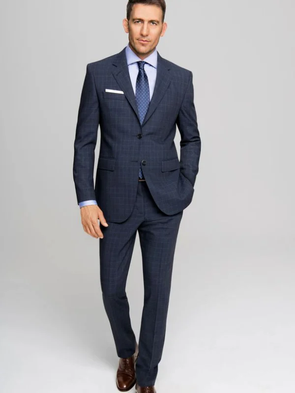
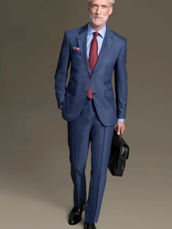
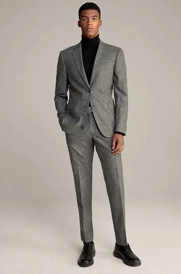
When you compare shirt areas, the blue references provide three starting points. Pale blue stays closer in colour to darker navy. Stripes divide the neck area beneath a red tie. White creates a brighter frame above a blue waistcoat. The complete grey view instead shows a black turtleneck and deliberately no further shirt collar. Use it as another visible neck option without equating garment forms or adopting every accessory simultaneously. Each picture offers a separate relationship rather than repeating one shirt choice in a different colour.
Select two actual shirts for your existing jacket first. Keep tie and pocket accent aside during the initial comparison. Would you like clearer pale separation or a closer colour relationship? Add a single neck solution afterwards and inspect the visible collar area again.
Include a waistcoat if you actually intend to wear one and assess the combination without the jacket too. Inspect shirt edge and hands in natural posture. These images explain neither material nor an adjustable collar feature. Their value lies in clear visible relationships that help choose a shirt before testing the full combination with trousers and shoes.