A suit and tie combination becomes easier to choose when you assess each task in turn. Start with the tie’s tone beside shirt and jacket, then compare surface and pattern. Decide whether a pocket square or another accent should repeat a colour afterwards. These five views show how that order makes the comparison more concrete. An attractive individual piece need not resolve every decision at once. Begin with the suit you actually want to wear rather than changing it for every new tie.
Suit and tie choices begin with the shirt
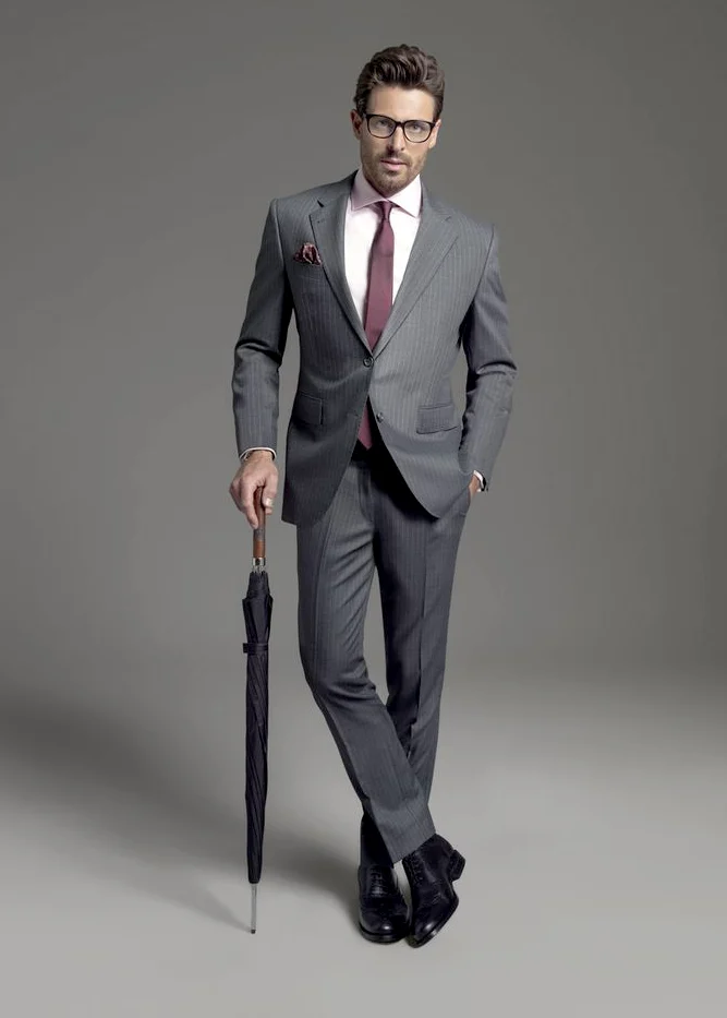
The grey ensemble with a warm pale shirt area shows a brown-gold-looking tie with a distinct small surface texture. The other grey striped full view pairs a pale pink shirt with a darker reddish tie. Both retain grey in the main pieces but change the inner colour group. Do not choose only between brown and red ties. Consider which shirt surface you want beside them first. Another shirt tone changes the relationship between neck and lapels before the tie pattern even enters the comparison.
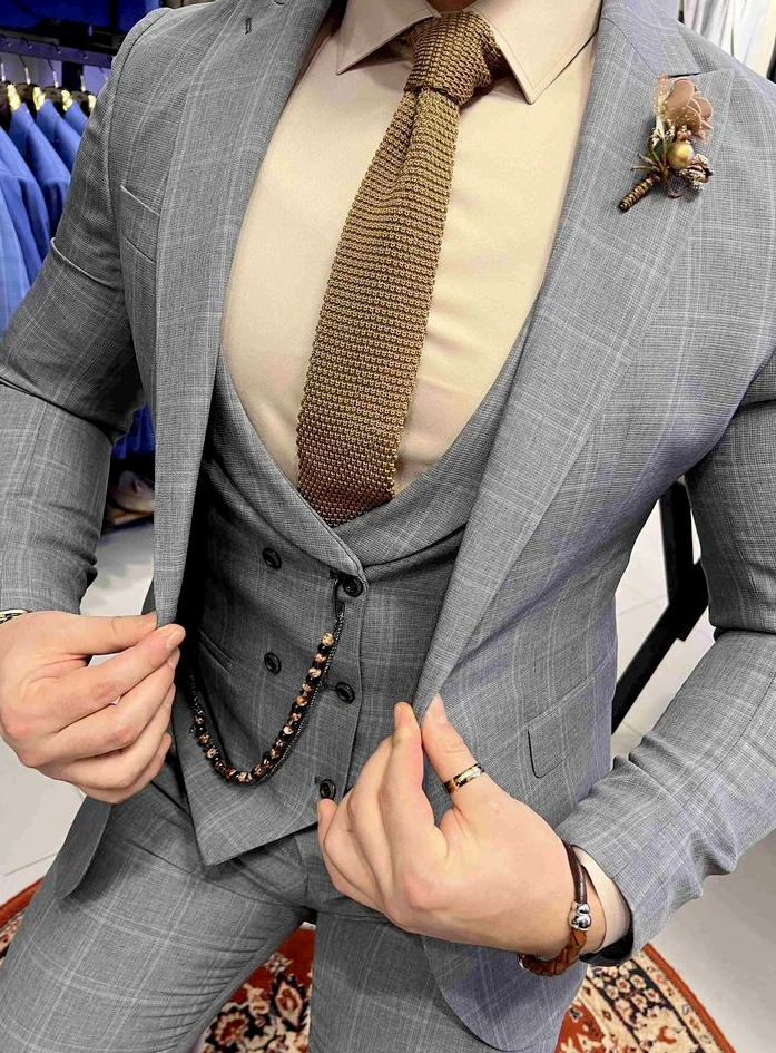
Place two real shirts beneath the same jacket and photograph the front from the same distance. Retain the preferred shirt as a fixed base, then try two ties. If a preference is not immediately clear, describe the difference: warmer and closer to the shirt, or darker and more separated. That description is more useful than seeking a universally correct colour. Our shirt guide for a blue suit provides further questions about choosing the inner area.
Assess light and dark before small pattern
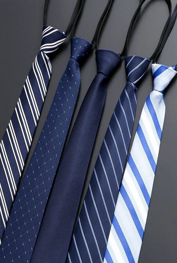
The blue ties arranged beside each other range from a largely quiet dark surface to broad pale diagonals. Small scattered points and narrower lines appear between them. Look from conversation distance first. Which tie reads mainly dark, and which becomes lighter through its pale areas? You are comparing the broad effect before judging an individual line. On a real shirt, a small dotted drawing can be interesting close up while still reading as a quiet surface from farther away.
Try a quieter and a more visibly divided version at the neck rather than only laying them over a sleeve. Keep the knot reasonably similar initially so the lightness difference remains understandable. Look at the visible width between the lapels and the shape of the shirt collar. The knot need not meet a prescribed measurement here; assess it with your actual shirt and preferred front arrangement. Decide afterwards whether you enjoy the visible diagonal or the finer drawing. Additional accessories can wait until this initial comparison is clear.
Treat visible texture as a separate choice
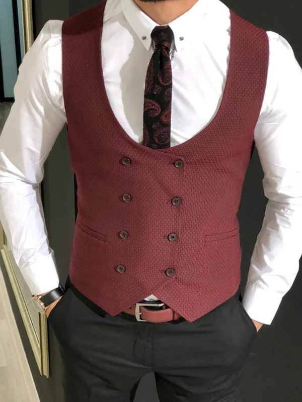
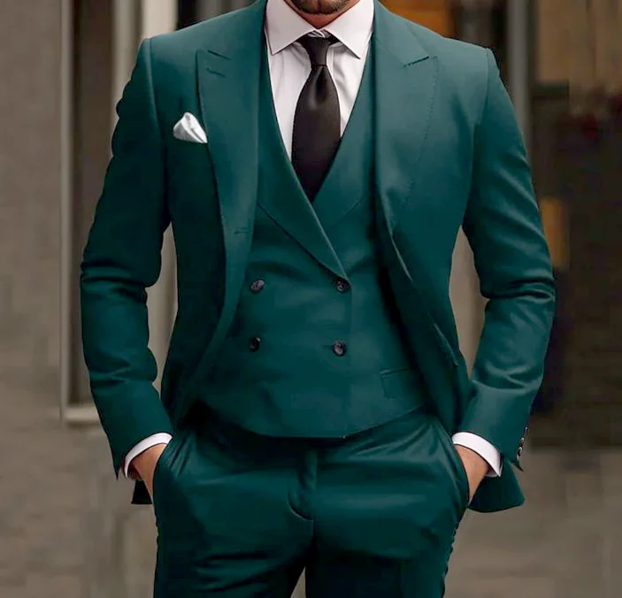
In the close grey view, the brownish tie stands apart from the pale shirt through its pronounced small-scale surface. In the green ensemble, the dark tie remains quieter while an additional buttoned waistcoat enlarges the middle. Tie surface and waistcoat shape are different decisions. Enjoying a textured-looking tie does not require adopting the same waistcoat or the prominent decorative chain in the grey example. Identify the quality you enjoy first rather than inheriting every accompanying accent.
Compare a visually quieter tie with a more textured-looking one in reasonably similar tones. Keep shirt and jacket unchanged. Look once in side lighting and once frontally to see the actual differences on the offered pieces. Describe the appearance without inferring a fibre. Ask separately about composition and intended care. Your styling preference can be clear while those product questions still need answers. Connect the confirmed information with the actual candidate before making the final choice rather than treating its surface as a complete specification.
Distinguish repetition from another focal point
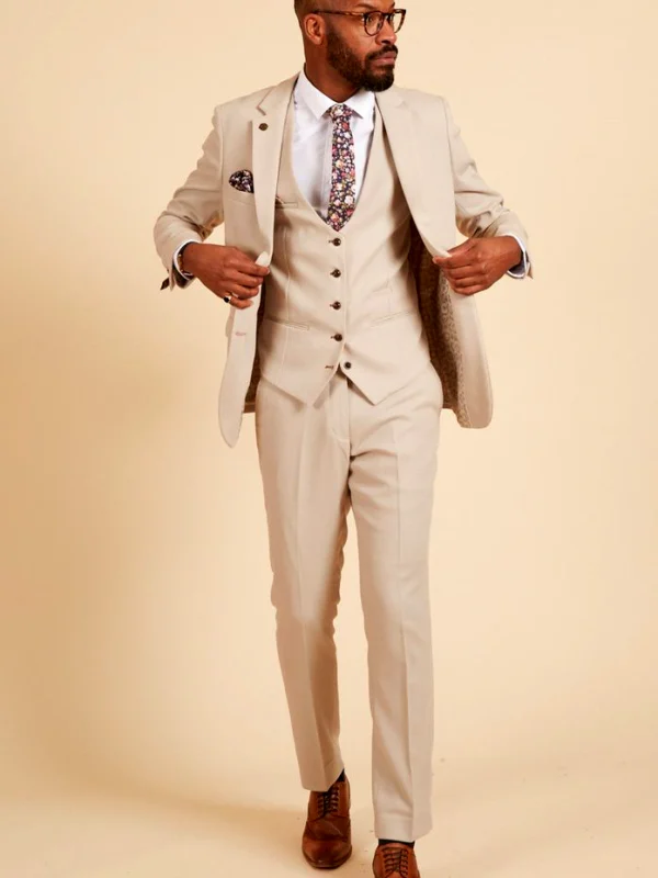
The beige-grey close view combines a multicoloured curling-pattern tie with a darker brownish pocket square and a pale floral lapel decoration. Several accent positions are present. The tie already contains darker and stronger blue areas. Consider whether you want to repeat one in the square or see a quieter surface beside the pattern. Identical motifs are unnecessary. You are choosing a relationship between positions rather than a compulsory matching set. Identify the tie’s main and secondary colours before selecting the other pieces.
Remove the lapel decoration first during a similar trial. Assess tie and square, then add the third piece again. You may enjoy another pale point at the lapel, or find the inner pattern enough by itself. The suit pattern mixing guide extends the comparison between drawings. Borrow the relevant question without treating every textured surface as an equally prominent pattern. What matters is which area registers first and whether the addition changes that order in a way you enjoy.
Include the waistcoat in the visible frame
The green ensemble places a quiet dark tie over a pale shirt and a high-reaching green waistcoat. Its overlapping front and several buttons occupy much of the middle. In the grey textured close view, the tie also sits inside another waistcoat line but has different accents beside it. Check how much of your selected tie remains visible in the complete outfit. Judging its entire length laid out on a table can otherwise give a different impression from the worn version.
Fasten the intended pieces as you expect to wear them and sit down. Look again at the knot and visible lower area. Add the bag or object you will actually carry at the occasion. If one detail feels busier than you want, remove only one accessory first and compare again. You need not rebuild everything immediately. A fixed shirt makes the effect of one change particularly clear. Record two acceptable tie versions with the chosen suit and shirt, assigning each a short purpose such as quiet dark contrast or visibly divided accent.
Keep a photograph of the complete front with the selected square. Later replacements can then be assessed through their actual role rather than a similar colour name alone. Read the care label of the real product too; the GINETEX care-symbol explanation helps interpret its markings. Visible texture does not prescribe treatment. Your final arrangement can retain a clear relationship: colour chosen beside the shirt, a deliberate surface and repetition introduced because you enjoy its place in the complete outfit.
Keep the suit and shirt fixed first. Compare two tie tones at the neck, then assess surface, pattern and repetition in the remaining accessories.
Frequently asked questions
Must the tie and pocket square be identical?
No. You can repeat an existing colour or place a quiet surface beside the pattern. Compare their two positions across the complete upper outfit.
Does a textured-looking tie establish a particular fibre?
No. Its visible surface supplies a styling idea; establish composition on the actual product.
Can a tie be chosen from its individual photograph alone?
Assess it beside your shirt, lapels and other additions too. An individual view helps shortlist possibilities but does not show the complete relationship.