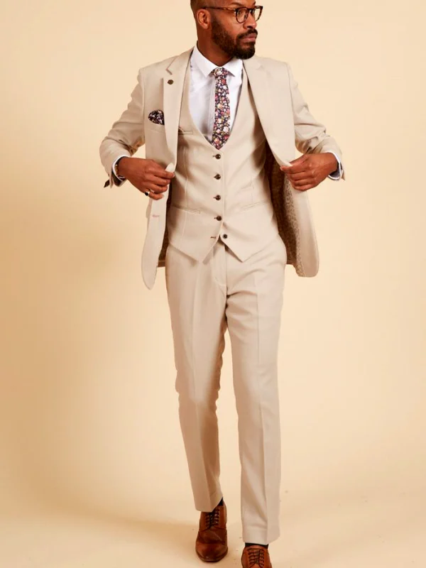
A white shirt with a suit is more than a colour choice. It creates pale areas between darker boundaries: at the neck, beneath the lapels and around the wrists. A waistcoat shape or different tie width changes how much remains visible. The references show a dark outfit, a blue look with a patterned tie and another blue look with a bow tie. Use them to compare the arrangement. Photographic brightness provides a starting point; choose the actual white tone through your own garments rather than the screen alone.
White shirt with a suit: locate the pale area first
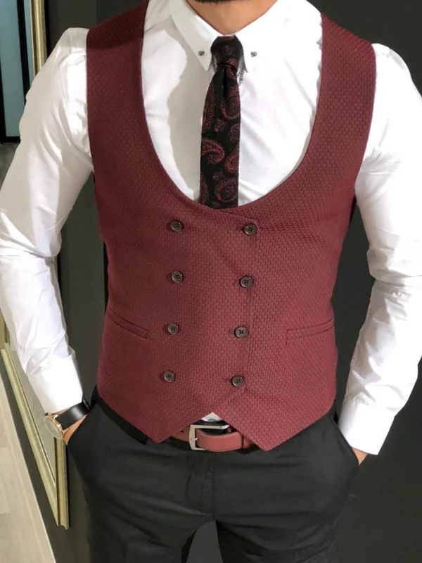
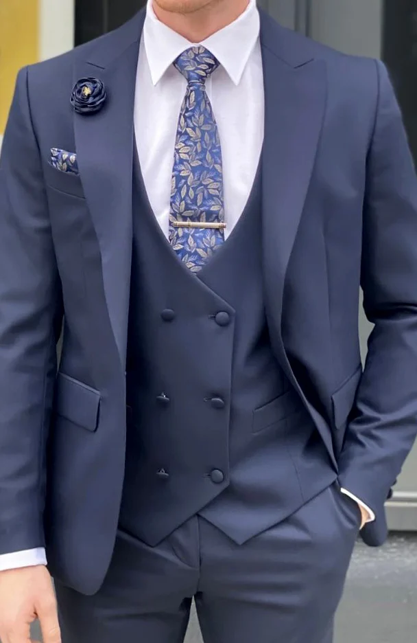
For the first comparison, look only between face and waist. In the dark outfit, the pale shirt continues beside a dark tie until the waistcoat defines its side boundaries. The open jacket frames that centre again. In the blue close view, an overlapping-looking waistcoat front rises higher and leaves a different opening. Compare the shape of that pale zone before choosing small decorations. Should it accompany the tie narrowly or appear as a broader area of its own? Both are useful preferences to describe.
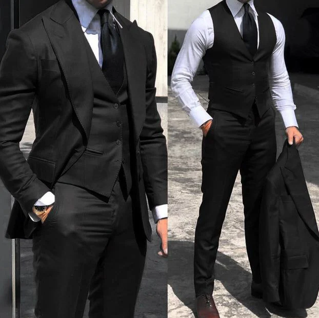
Lay the shirt beside your intended jacket, then put both on. Laying them out shows colour relationships but cannot establish the edges on your body. Fasten the collar as intended and hold your head naturally. Decide whether you want more even side areas or a looser arrangement around the centre. A hand-in-pocket photograph can shift the jacket front. Use a relaxed stance as the shared starting point for several alternatives, so that you are comparing garments rather than the effect of different poses.
Compare a dark tie, pattern and bow tie separately
A dark tie can divide the pale centre clearly and make a vertical connection towards the waistcoat. In the blue detail, the tie instead introduces paler leaf-like motifs into that centre. This adds another drawing over the light foundation. Decide whether you want the shirt to provide quiet spacing around a pattern or a clear contrast against a dark line. Neither choice needs a brand claim or a promise about social impact. The useful decision concerns the arrangement you enjoy wearing.
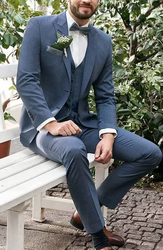
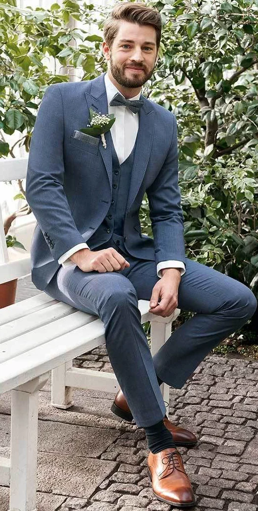
The seated blue reference adds a bow tie. Beneath it, a more continuous pale area remains than beside a long tie. Try both neck arrangements on the same shirt if the event permits the choice. Compare the distance to the waistcoat edge and the shape immediately below the chin. Select a pocket square or lapel accent afterwards. Changing several accessories at once makes it harder to establish whether you prefer the neckline itself or simply the additional decoration that arrived with the new version.
Include the shirt front as a drawing of its own
A pale shirt can still divide the centre through its button line, a chest pocket or other actual front details. Compare the real piece. A long tie may cover some of that drawing, while more continuous surface stays visible under a bow tie. If you want a particularly quiet centre, assess more than its shade. A shirt that looks attractive alone may create a different relationship beneath your selected waistcoat. Choose which front details you want visible before committing to the whole arrangement.
Treat the waistcoat opening as a shirt boundary
If you want a waistcoat, its opening helps determine the visible shirt area. The blue close view shows two button rows and an overlapping front shape; the seated picture has a different central button line. Describe the upper boundary you prefer without deriving a manufacturing process from it. Assess the whole arrangement on a worn garment. An interesting waistcoat photograph cannot explain how its opening will meet your own shirt collar and selected tie. The actual pieces need to answer that question together.
Sit in the real combination and reach for an object. Observe whether more shirt becomes visible around the waistband and whether you enjoy that transition. If you want a particular continuous boundary, discuss the actual fit on the product. The two-piece suit guide complements the basic decision about including a waistcoat at all. Here the next question is how that chosen layer visually limits the pale shirt. Choosing the extra garment and choosing the area inside it are related but separate steps.
Look at collar and cuffs together
The wrists provide small repetitions of the pale neck area. Check both arms hanging naturally first. Reach forwards as if taking a glass or passing an object next. The shirt sleeve may appear differently from its standing position. Decide whether the visible boundary feels comfortable beside your watch. A fixed amount copied from another image cannot replace the actual relationship between your sleeves. Compare both arms, since one hand in a pocket can otherwise make two similar cuffs look different in the reference.
Check the collar beneath the lapel too. Keep your head straight and turn it gently rather than staying in a selected photographic pose. A broad pale collar area with a narrow dark tie makes a different proportion from a wider neck accessory. Start with the actual shirt you intend to wear. The shirt with a blue suit guide adds colour comparisons beyond the white foundation. Use those alternatives separately from the decision about how much shirt you want to show.
Relate the light and other pale details
The pale shirts appear different under the lighting in each picture. Compare your actual pieces under shared light and then in the complete outfit. You do not have to match every light detail exactly. A small pocket square can repeat the shirt area, while a large pale bag introduces a new block. Decide where you want repetition. This is a visual choice rather than evidence of a particular fabric or higher quality. Keep genuine product information separate from the colour effect you are comparing.
Finish two looks for a focused decision. Keep jacket and trousers unchanged and alter only the neck accessory or proposed waistcoat edge. Look from conversation distance before checking the collar close up. Record the boundary you prefer and anything that bothers you while seated. Include the planned shoes and usual bag. Read the actual shirt and suit information separately; GINETEX explains care symbols. Follow each garment label. Your decision is complete when neck area, cuffs and remaining pieces work together as you actually intend to wear them.
Choose the visible shirt area between collar, neck accessory and jacket deliberately. Then assess cuffs and the complete outfit during ordinary movement.
Frequently asked questions
Is a dark tie compulsory with a pale shirt?
No. A dark tie creates a different central line from a patterned one or a bow tie. Choose through the invitation and your preferred distribution of areas.
Why should I try the shirt with the waistcoat?
The waistcoat limits the visible front shirt area. Its opening and the neck accessory therefore need to be assessed together.
Can I choose the exact white from a photograph?
No. Lighting and screens affect its appearance. Compare the actual garments together under the same light.
How should I assess the visible cuffs?
Relax your arms first, then reach forwards. Assess both sleeves with the real shirt and jacket instead of copying a fixed edge from another photograph.