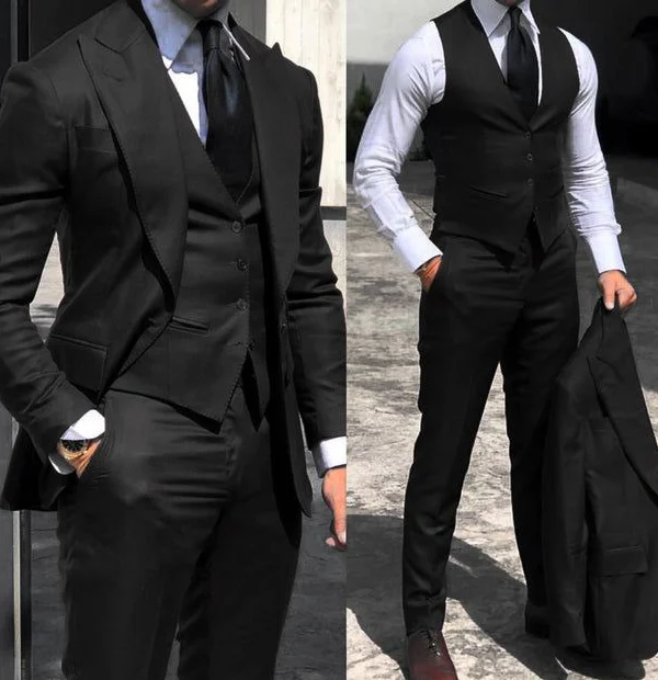
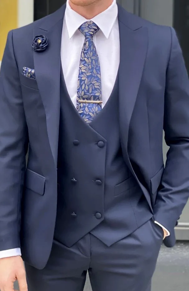
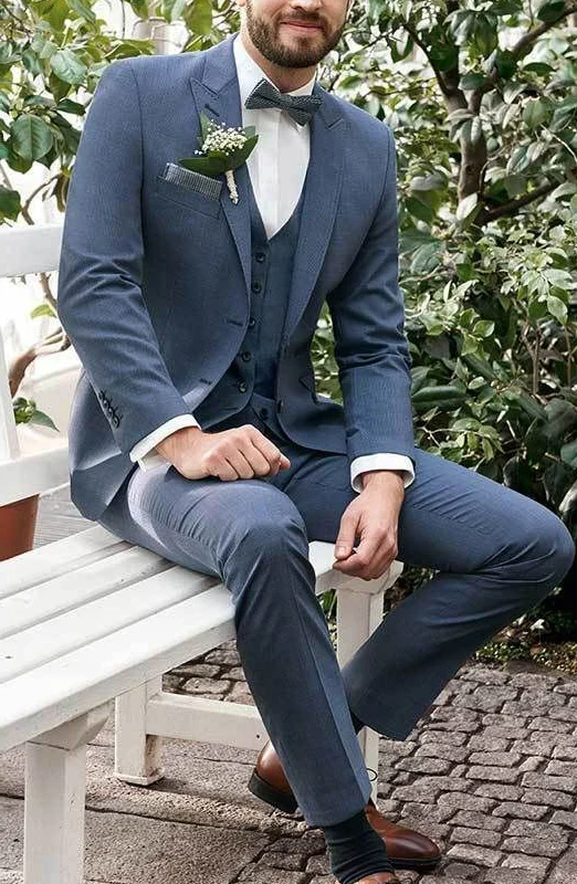
Pale shirt areas can be compared through their boundaries in this selection. The dark double view shows a pale shirt beside a dark tie and waistcoat. A jacket adds another frame in one view. The blue close photograph introduces a patterned tie and a higher overlapping-looking waistcoat front. In the seated blue outfit, a different pale shape remains beneath a bow tie. These relationships are the starting point before small decorative details enter the comparison.
Choose the arrangement you want to see around your own neck first. Should the pale area accompany a dark vertical line or remain more continuous beneath a bow tie? Compare the upper waistcoat edge and side shirt areas afterwards. Photographic brightness does not establish the actual white tone; try the real garments together under shared light.
Finally, assess the wrists as small repetitions of the upper area. Include your watch and relax both arms. This sequence gives you a precise fitting question: where do you want the shirt visible, and which edge should define it there? Check the answer seated as well as standing.