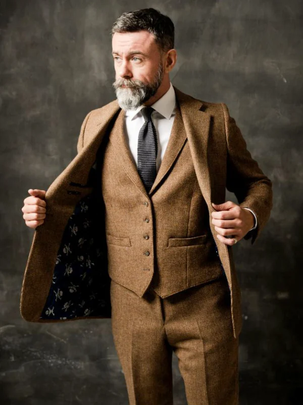
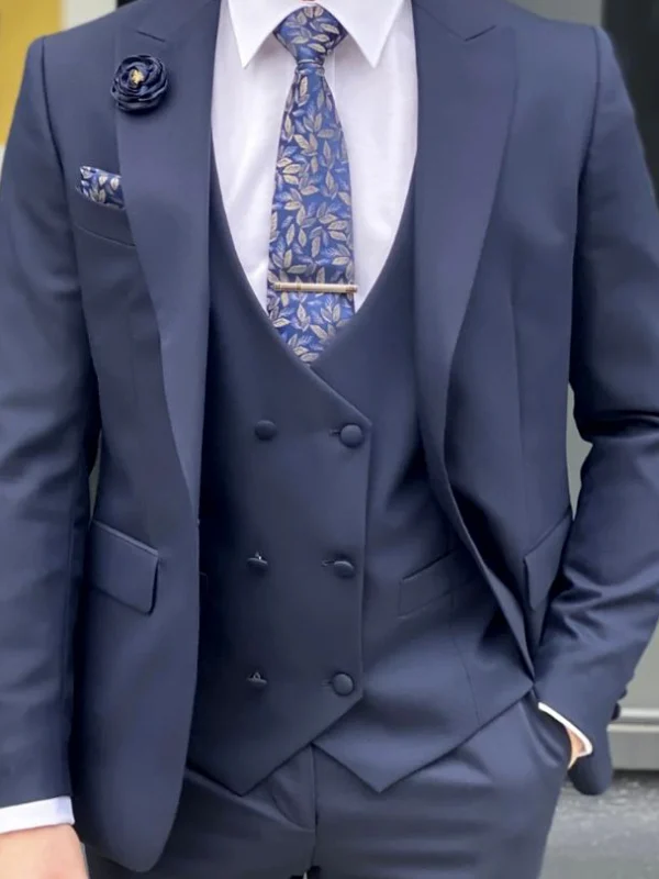
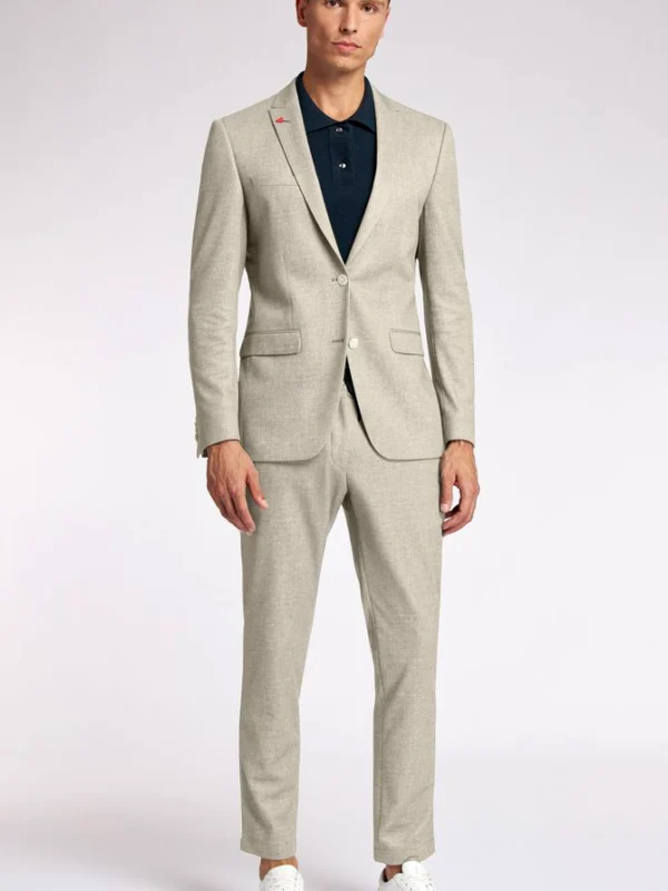
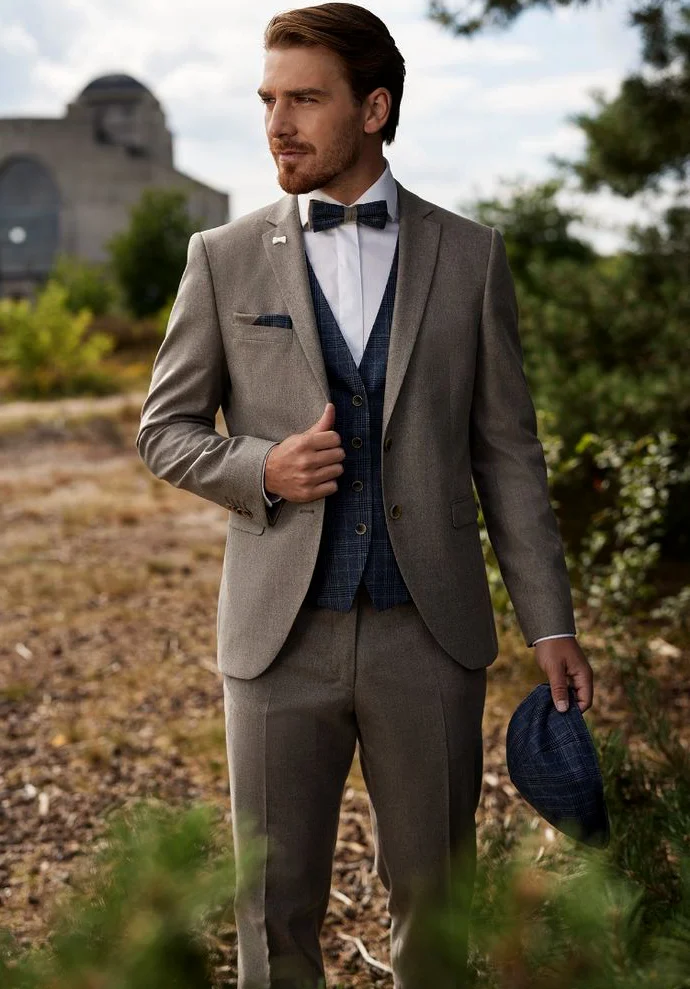
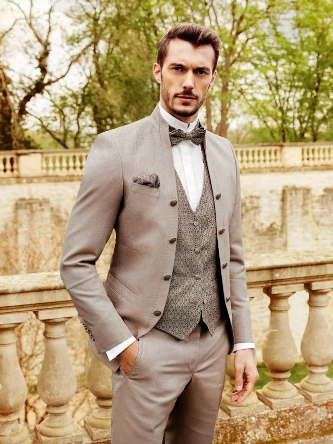
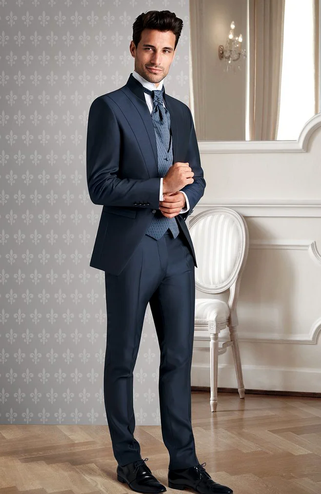
A contrast waistcoat changes the visible inner area of a suit without requiring a different overall field of colour. It may look darker than the jacket, introduce a recognisable pattern or differ mainly through its surface design. These references show a grey-brown suit with a dark checked-looking waistcoat, a pale combination with a smaller pattern and a tonal blue variation. A black double-breasted suit deliberately adds another front arrangement without a visible waistcoat. Compare them as specific combinations rather than evidence of price or workmanship.
Choose the kind of difference in a contrast waistcoat
Begin with the actual jacket and trousers you intend to use. Decide what kind of difference you want across the inner area. The dark blue waistcoat beside grey-brown stands out clearly; the smaller pale pattern stays closer to the lightness of the outer pieces. The blue look creates a finer variation within one colour family. These are three different jobs even though each includes another garment beneath the jacket. Describe the particular relationship before deciding which one you prefer.
Hold two real waistcoats beside the same jacket and wear each in turn. Look initially at the larger areas from an ordinary distance. Should the waistcoat attract attention first or mainly shape the transition between shirt and jacket? Record a clear preference, such as a darker inner field beside a quiet shirt. If you change colour and pattern together, name those differences separately. You can then explain which one actually settled the choice rather than relying on a general impression of a busier outfit.
Judge pattern scale within the visible waistcoat window
The darker reference has a larger checked-looking design, while the pale version carries many smaller repeated shapes. What matters is how much remains visible inside the open jacket. A pattern can look pronounced close up and become a quieter field in the complete outfit. Compare the size of that inner window rather than only a fabric detail. Examine the lower waistcoat area that may appear below the jacket opening too, keeping its contribution to the full outline in view.
A photograph from the same distance and under the same lighting helps compare a contrast waistcoat. Start without an extra pocket square so you can judge the pattern independently. Add it as a separate decision later. If you like a pattern but find the large area too prominent, seek a smaller repeat or a closer shade. You need not reject the entire idea. Describing the preferred strength more accurately supports a purposeful search instead of simply asking for a louder or quieter outfit.
Compare shirt area, bow tie and long tie separately
The two lighter suits are pictured with bow ties, while the blue look has a longer tie. This changes the shirt area visible above the waistcoat. Choose the intended neck accessory first, then inspect its transition into the inner V line. A longer tie may extend farther into the waistcoat window; a bow tie leaves a different pale shirt area visible. These are relationships to compare rather than a universal requirement for a particular kind of celebration or every wearer.
Keep shirt and jacket unchanged on the first attempt and swap only the neck accessory. If the waistcoat already has a pattern, try a quieter addition first and a patterned alternative afterwards if desired. Decide through the complete upper area. Both tie and waistcoat have visible design in the blue example, but that does not mean you need to adopt two patterns. Your own choice may seek a clearer separation between neck accent and inner field, with each addition having a distinct role.
Test the jacket front as the inner area’s frame
Your contrast waistcoat needs to work with the actual jacket front. Compare its intended open and closed states on the worn outfit. Assess how much waistcoat stays visible and where the outer edge bounds it. The pale model with several dark front buttons already has another rhythm on the outside. Consider whether you want those points to lead beside the inner pattern or would prefer a quieter outer appearance. The jacket is an active part of the arrangement rather than a neutral border around every possible waistcoat.
The black double-breasted reference offers another route: an overlapping dark front and broad smooth lapels determine the picture without a visible waistcoat. Use it as a deliberate alternative. You may want an inner patterned window or prefer the larger closed front. Judge both within the same occasion setting. An additional waistcoat is neither automatic evidence of quality nor a necessary finish for every suit. It is another concrete surface whose styling role you can choose, including deciding that the outfit works better without it.
Avoid automatically multiplying pocket squares and patterns
The grey-brown picture repeats a dark pattern idea in the cap held at the side. That is a visible addition to judge separately. Do you intend to wear it, or mainly like its colour relationship with the waistcoat? A photograph containing held accessories does not require identical equipment. Compare suit and inner field alone first. Add the pocket square afterwards and inspect how much pale shirt and waistcoat window remain readable as separate areas, keeping the larger relationship clear before adding another small repetition.
Select further jewellery or accessories individually. The pale patterned waistcoat with bow tie and pocket square already creates several small areas. You may deliberately enjoy that echo or choose to remove one piece. Lay out the real items instead of relying on similar small screen photographs. View the worn look from a distance and identify which pattern remains readable. The comparison should explain your preferred order of attention, rather than merely prove that another coordinating accessory can be found for every pattern already present.
View the waistcoat without the jacket as a complete state
More waistcoat becomes visible if you remove the jacket later. Plan that second view with the actual shirt and trousers. Check the waistband transition standing and sitting, and inspect the sides. Request a rear view of an unfamiliar waistcoat as well, since the front references do not show that area. A pattern you liked within a small window does not automatically have the same effect when it becomes a much larger visible part of the complete outfit.
Move your arms, reach for an object and sit before recording the chosen state. This concerns the position of your actual combination rather than a fit guarantee inferred from the photograph. If adjustment is needed, have it assessed with shirt, trouser waistband and waistcoat finish worn together. Keep shoes and other pieces unchanged initially so further swaps do not confuse the comparison. Only then decide whether removing the jacket is actually part of your intended plans, with both states considered in advance.
Decide between two waistcoat ideas with the same outer pieces
Limit the final comparison to two clear descriptions, such as a darker pattern beside grey-brown and a closer tonal difference. Our checked suit selection helps compare larger pattern fields with the small inner window. The suit lapel guide adds another view of the outer frame. Borrow the relevant question without changing jacket, trousers and every accessory at once. Your contrast waistcoat should create an understandable change within a familiar base rather than several unrelated new choices.
Read each actual garment’s care information separately. The GINETEX symbol guide explains washing, bleaching, drying, ironing and professional textile care; matching colours or similar patterns do not establish one shared process. Record the chosen waistcoat, neck accessory and intended states with and without the jacket. You can then choose a complete outfit whose inner area you have actually seen, instead of adopting numerous supposedly related pieces solely because they appear together in a reference photograph.
Choose the inner colour field of a contrast waistcoat first. Compare pattern scale, neck accessory and complete states with and without the jacket afterwards.
Frequently asked questions
Must a contrast waistcoat be much darker?
No. The references show darker contrast, a smaller close pattern and a finer tonal blue difference as separate options.
Should I copy the patterned cap in the grey-brown picture?
Only if you actually intend to use it. Assess pattern repetition separately from the suit and add accessories individually.
What should I check if I remove the jacket?
Assess the larger visible waistcoat area, rear view and trouser waistband transition sitting and standing with the actual shirt.
Does the black double-breasted suit show another contrast waistcoat?
No. No waistcoat is visible there; the overlapping outer front compares another design arrangement.