A coloured suit for men can read as a large connected area or become more divided through shirt, waistcoat and accessories. These four references offer different starting shades: burgundy beside black, pale blue with light inner layers, teal with a pink shirt and muted blue over a black polo. Choose the colour direction you actually want to wear first. Compare adjoining surfaces afterwards and add patterns individually. The complete look then develops from understandable decisions rather than automatically including every additional attractive tie or pocket square that could sit beside the suit you initially liked.
1. Start a coloured suit for men with the intended base shade
Inspect complete jacket and trousers together before zooming into small details. Burgundy forms a darker reddish whole in the first image. The pale blue reference is considerably lighter, while teal connects green and blue in another direction. The fourth version is a restrained middle blue. Describe the intended lightness and colour direction in a shop and ask for actual candidates or fabric samples. The word blue alone cannot explain whether you want a pale, strong or muted area beside your face and shirt, so establish that range before assembling every accompanying piece.
Compare actual garments in the same lighting where possible. Inspect quieter areas and folds together instead of selecting only the brightest reflection. View jacket and trousers with a consistent shirt or top colour initially. This keeps clear whether the suit shade or a new addition is influencing the decision. An image on another background can indicate a direction; check the actual colour connection on the offered piece. Record two candidates to develop as complete outfits rather than collecting every shade simultaneously, keeping the next comparison focused on a difference you can explain.
2. Compare burgundy with a dark inner area
The burgundy look connects jacket and trousers with a black high-neck top and dark shoes. The inner area stays clearly separated from the reddish suit without introducing another pale zone. Use it to compare whether you want a quieter dark middle. The high-neck garment need not be copied automatically. Try the shirt or top shape you intend to wear on the real suit and inspect how the colour around neck and chest changes. The same burgundy can receive different emphasis beside another upper area, independently of further small accessories.
A coloured suit for men is not chosen through its lapel alone. Step back and inspect the relationship between suit area, inner top and visible shoe. You can enjoy the darker middle while seeking another neckline; record those wishes separately. Check the jacket closed and open where both states are intended. With a different amount of top visible, the same suit may be weighted differently. Decide through those actual views which colour beside the suit performs the task you want, instead of allowing one appealing front pose to determine the complete arrangement for you.
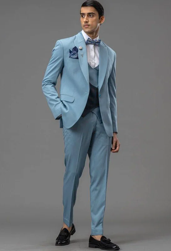
3. View pale blue with light layers and small dark accents
The pale blue reference combines jacket and trousers with a similar waistcoat and a light shirt. A darker bow tie and pocket square add smaller accents. Lightness is distributed differently from the burgundy example. Compare the larger inner areas before introducing bow tie and square. Should the middle stay close to the light suit or create a clearer difference? Try the actual pieces and inspect the complete upper body. A small fabric square’s colour alone cannot explain how the whole middle of the outfit will appear once shirt and waistcoat occupy their visible areas.
If you want a bow tie, assess it as a separate shape beside the collar. Compare a quieter option with a more patterned one while shirt and suit remain unchanged. Add the pocket square afterwards. It need not repeat every motif already present in the bow tie. The reference supplies one possible combination rather than a universal instruction for your event. Establish the intended setting from the invitation or organiser and choose which actual additions you want within it. That keeps a product image and your concrete use as different sources of information.
4. Connect teal and pink to pattern deliberately
The teal outfit shows a subtle windowpane grid, pink shirt and patterned tie. A matching waistcoat, floral lapel detail and small pocket accent introduce further elements. For your comparison, begin with the teal-pink relationship. Try it without every small addition and decide whether the larger adjoining areas appeal. Add a tie only then. You can enjoy the colour idea while wanting less pattern. The whole visible accessory arrangement need not become an unchangeable part of selecting a coloured suit; assessing one component at a time leaves its contribution identifiable.
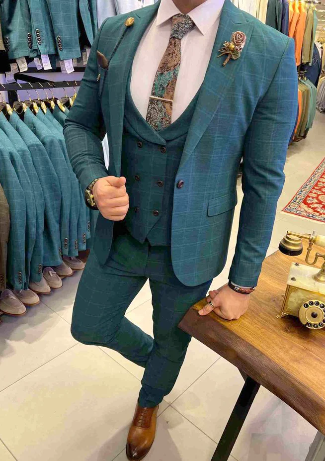
Hold a quieter and more patterned tie against the actual shirt in turn. View their relationship with the windowpane lines from ordinary conversational distance. The checked suit guide adds questions about pattern distribution; the suit lapel guide supports comparing collar and visible jacket area. Transfer the relevant question to your colour combination. The teal photograph uses a leaning pose with one bent leg, so add a neutral stance before deciding the complete lower line. Your real shoes help complete that assessment on the actual outfit.
5. Test muted blue with a polo and pale shoes as an alternative
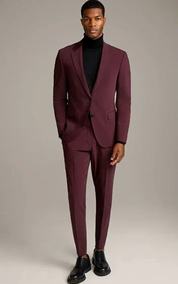
The fourth reference combines a muted blue suit with a black polo and white flat shoes. Tie-like cords appear at the trouser waist. Those details distinguish the arrangement from shirt-and-tie versions. Inspect the black area beneath the open jacket first, then the pale lower accent. Do you want that clear change at the shoe or a quieter finish? Wear actual shoes to the fitting. A pale shoe in a product image establishes neither the right length of your trousers nor suitability for your particular event, which needs its own setting and clothing information.
A coloured suit for men can find another use through a different inner shape where the actual setting allows it. Replace only the top first, keeping suit and shoes unchanged. Check standing, seated and without the jacket. Decide whether the polo supplies the upper surface you want or a shirt better serves your plan. The comparison needs no universal verdict about which version is inherently more elegant. It should show which complete outfit appeals and works through the actions you intend, with the effect of the changed top kept clear by the other consistent pieces.
6. Complete colour and accessories within the full outfit
Assemble the chosen suit with shirt or top, shoes and actual planned additions. Remove one small detail afterwards and inspect it again. Perhaps another lapel motif is unnecessary because tie and fabric grid already create enough visible directions. Or you may deliberately want a repeated colour. Record the choice. A coloured suit for men is then defined by a clear connection between base shade and adjoining surfaces you have compared, rather than the greatest quantity of matching small items. Every further addition can be assessed by its visible role within that arrangement.
Clarify composition, separate pieces and care for the actual offer. The GINETEX care-symbol explanation helps interpret labels; colour, reflection and a visible grid prescribe no treatment. Discuss intended changes on the worn outfit with your planned shoes and ask about scope and final fitting. Record the confirmed combination in full. You can then return to an already tested colour arrangement and replace a shirt or accessory deliberately later, without making the entire choice dependent on another single attractive photograph. The record explains which relationship you wanted to retain.
A coloured suit for men can be selected through its base shade and adjoining shirt or top areas, adding pattern and accessories individually.
Frequently asked questions
Does a coloured suit need a white shirt?
No. The references also show black and pink. Select the adjoining colour through the actual outfit and the event’s stated setting.
Must I copy the photographed bow tie, tie and pocket square?
No. Compare additions individually and establish which pieces you actually want to wear for your occasion.
Does the teal close view show the complete ordinary stance?
No. The wearer leans against a surface with one leg bent. Add a normal full view to assess trousers and shoes together.