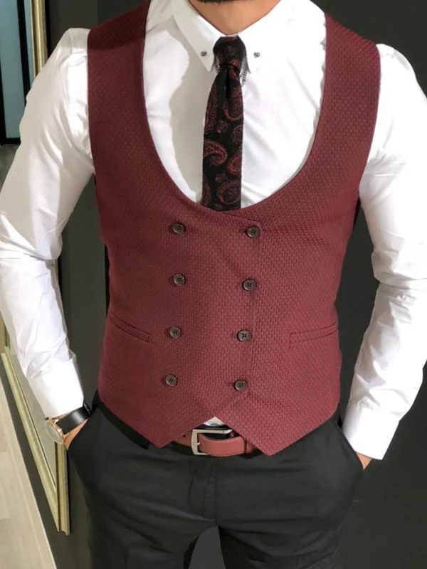
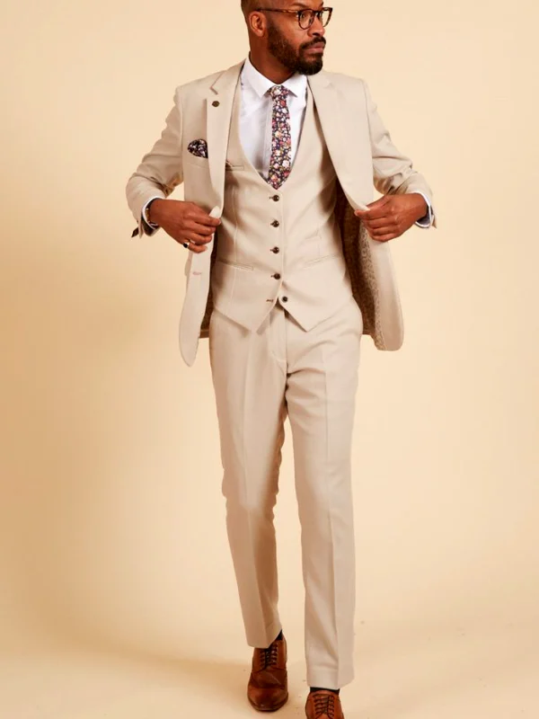
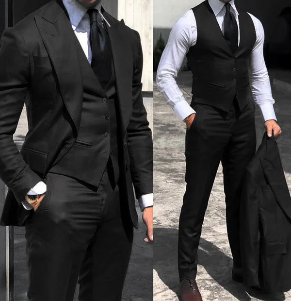
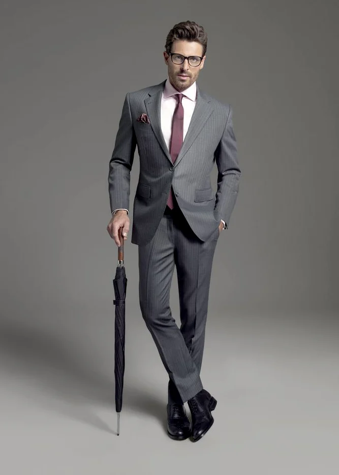
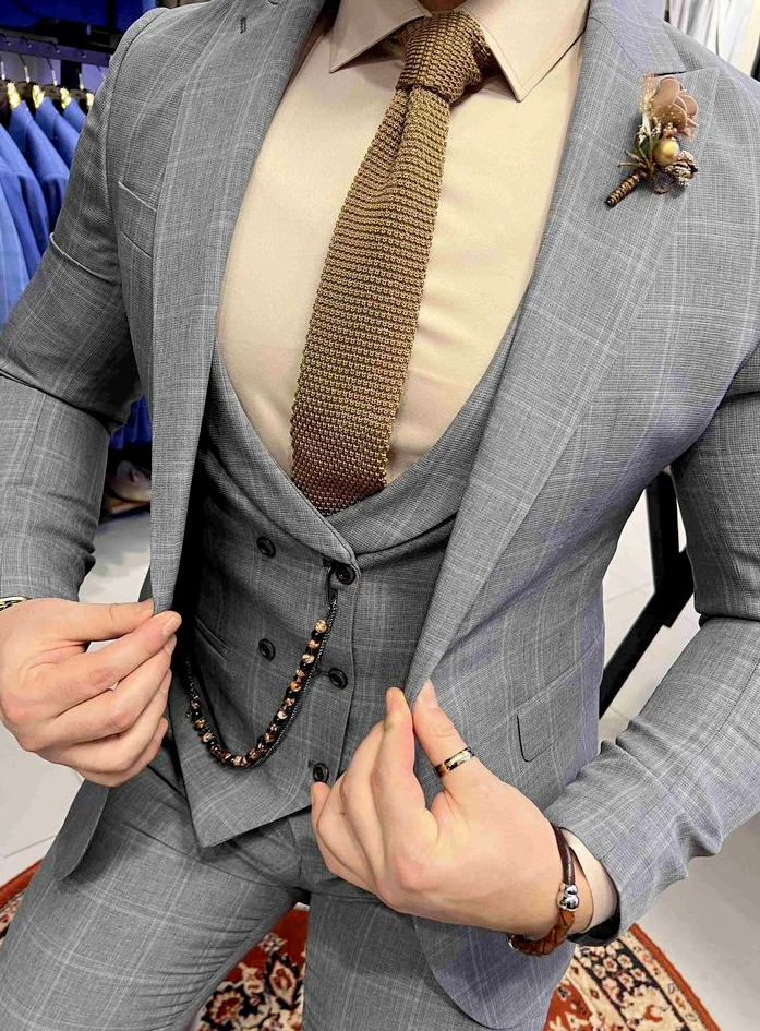
A flannel suit should be selected through a concrete cloth description rather than a grey photograph or soft-looking surface. Request the name and composition of the fabric actually being offered. Compare a corresponding sample and the finished cut afterwards. These pictures supply different styling directions: a dark visibly textured jacket, a grey striped full outfit and a closer grey combination with a waistcoat. They do not confirm a flannel quality. Their value lies in choosing the desired shape and additions separately from the material question.
Begin a flannel suit choice with an identified sample
Ask which cloth belongs to which offered garment. A sample with a traceable reference helps you recognise the discussed surface later. Record its stated composition and available versions. If a provider offers several fabrics beneath the same styling photograph, request the precise reference for your choice. This avoids equating a broad photographic impression with the particular version actually ordered. An attractive dark appearance does not answer that question. Establish a clear relationship between sample, offer and garment before making the final decision.
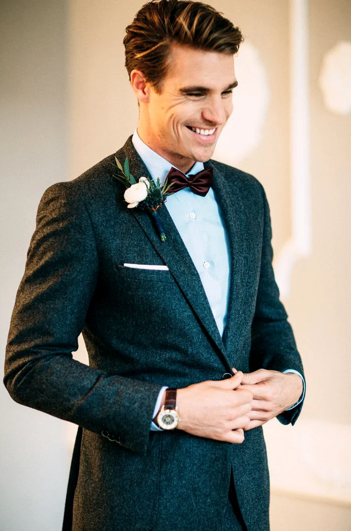
The Holland & Sherry description of HS2375 explains combed yarns and a milled surface treatment for that collection. This is a specific manufacturer example rather than an identification of the photographed outfits. Use it as a reason to ask about the actual construction in your offer. You need not guess a technical name from a screen image. Begin with identifiable fabric information and ask how any broader properties or promotional descriptions relate to the actual candidate.
View surface and colour together on the real piece
The dark jacket in the closer portrait shows a more irregular-looking surface beside a pale shirt. The grey striped full view looks quieter from a greater distance. These differences offer two questions: how clearly should the surface register across the outfit, and how much should its close-up drawing contribute? View your sample at both distances. A close photograph can emphasise small textures strongly, while a complete suit distributes the same surface across considerably more space. See the actual candidate rather than assuming both views are equivalent.
Hold two real samples together and add the intended shirt. Compare them under the same light rather than viewing each cloth alone on a different day. If you want a warmer or cooler grey impression, record that preference against the sample you have actually seen. Do not depend entirely on a colour name. A picture can begin the search, but the final relationship between cloth, shirt and accessories should be visible in the real offer. Retain a confirmed reference for later comparisons.
Choose drawing and inner colour separately
The grey vertically lined full outfit combines a reddish tie with a pale pink shirt. The closer grey version uses a warmer-looking shirt and brownish textured tie. You can compare these inner colour directions without identifying a fabric type. Decide whether the suit itself should remain quiet or carry a recognisable drawing first. Keep the preferred main cloth fixed and vary the shirt afterwards. The difference supplied by an addition then becomes clearer rather than being confused with a simultaneous material change.
If you are considering a more visibly patterned version, compare it with a quieter alternative in a complete outfit. View the lines with the jacket open and fastened as intended. Crossed legs or a held front in a photograph reveal different areas from normal standing. Our virgin wool suit questions help distinguish material information from shape decisions. Transfer the relevant comparison without using that link to declare the pictured grey outfit either virgin wool or flannel. Its contribution here remains a visible arrangement to assess.
Judge the finished construction as well as the sample
A small cloth sample does not show the complete jacket. The actual suit also includes lapels, inner layers, pockets and the relationship with trousers. Try it with your intended shirt and look at front, side and back. Assess the collar transition and visible width beside the torso. If you enjoy the sample but find the finished garment different from your expectation, describe the difference precisely. It may concern shape rather than surface, leaving room to compare another cut without immediately abandoning the cloth direction.
Sit, reach for an object and walk several steps. Check the front before smoothing it afterwards. Those movements help identify your own wearing preference rather than guaranteeing the behaviour of every suit with the same description. If adjustments seem necessary, ask about the actual intervention and another fitting. Discuss the intended finished state, beyond an isolated measurement change. Keep shirt and shoes consistent at the later check so you can assess whether the work resolved the particular visual or movement question you raised.
Choose waistcoat and neckline for your own use
The dark textured jacket is shown with a small dark bow and pale lapel decoration. The grey pictures use ties instead, with a further waistcoat in the close view. These elements change how much main cloth remains visible. If you choose a surface for its large quiet area, check how much stays exposed in the completed outfit. A waistcoat can create another wanted surface, but need not automatically belong to your selection. Ask which pieces the real offer actually includes rather than assuming every photographed accessory is supplied.
Compare the provider’s actual options with your own intended appointments. Begin with one clear neckline arrangement and add square or lapel accent individually. The dark suit guide extends the relationship between inner contrast and main surface. Decide the amount of decoration on the worn outfit. A floral decoration in a photograph is a styling idea rather than a universal occasion requirement. The decorative chain in the grey close view is another separate choice, not something compelled by your interest in a particular cloth.
Record a verifiable selection
For the final two offers, record three things: identified cloth reference, confirmed composition and your observation on the finished garment you tried. Add proposed alterations and the stated costs and dates. Clarify which pieces and subsequent adjustments are actually included. You can then compare the same tasks rather than two attractive photographs. A quieter or more noticeably textured surface can each be an appropriate personal choice once assessed within the complete cut. Record the difference that matters to you in one clear sentence for later suggestions.
Read the care label on the actual suit and each additional piece before treatment. The GINETEX care-symbol explanation supports interpreting its markings. Do not plan generic washing or steaming from a fabric name alone. With a confirmed reference, deliberate drawing and a tried complete outfit, later offers become easier to compare. The photograph remains a shape reference while the material decision stays connected to the real product. That distinction preserves the appearance you enjoy without assigning unverified properties to the pictured garment.
Connect the flannel description to an actual cloth reference and composition. Compare pattern, finished shape and additions afterwards.
Frequently asked questions
Is every grey suit made from flannel?
No. Grey describes a visible colour direction rather than reliably identifying the cloth. Connect the offer to actual fabric information.
Can a cloth sample replace a fitting?
No. It helps compare surface, colour and product information; the finished garment also shows cut, inner layers and movement.
Is one care method suitable for every flannel suit?
Follow the information on the particular garment. The name alone does not prescribe one treatment for every component.