Wedding dress colours become easier to choose when you separate three questions: which colour family you like, how much space it should occupy, and which contrasts you want beside it. These six photographs range from pink to warm pale shades, light lilac, white and a blue-purple combination. Their skirt shapes and decoration also differ considerably. Use them as comparison ideas for your own bridal outfit. A visible colour does not establish the garment’s intended ceremony or composition; its value here is helping you describe the effect you want more precisely.
Compare wedding dress colours as large areas first
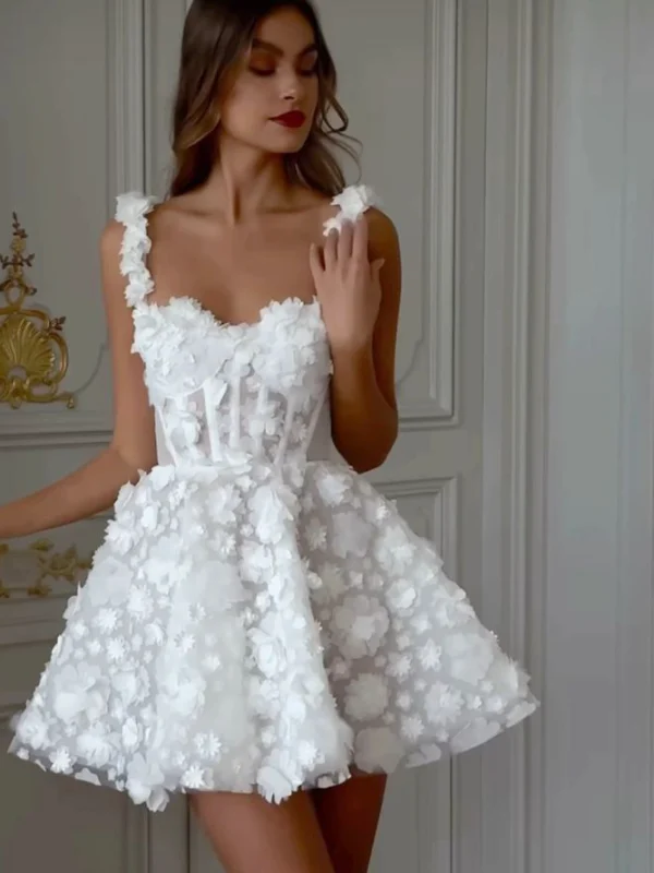
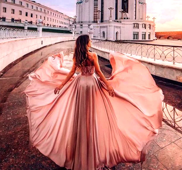
The pink skirt in the rear view occupies almost the entire frame. Its lifted sides make the colour area especially prominent. The plain white dress distributes a pale colour over a quiet front, broad straps and a full skirt. First ask how you want the outfit to read from several steps away. Would you like an unmistakable colour, or a pale base whose folds and shadows explain its shape? Decoration can wait while you establish this broad preference. Neither option requires a particular kind of jewellery or bridal accessory.
Place two real candidates together and keep the remaining decisions as consistent as possible. If one dress is narrow and the other very wide, you are also comparing different amounts of colour. Holding a small sample near your face can help, but it cannot show the complete effect. Ask to see a larger piece of the actual fabric or try the whole garment. If you photograph the alternatives, use similar distances and backgrounds. Record your own observation before looking for a supposedly universal shade that should suit everyone.
Separate quiet pink from pink with dense decoration
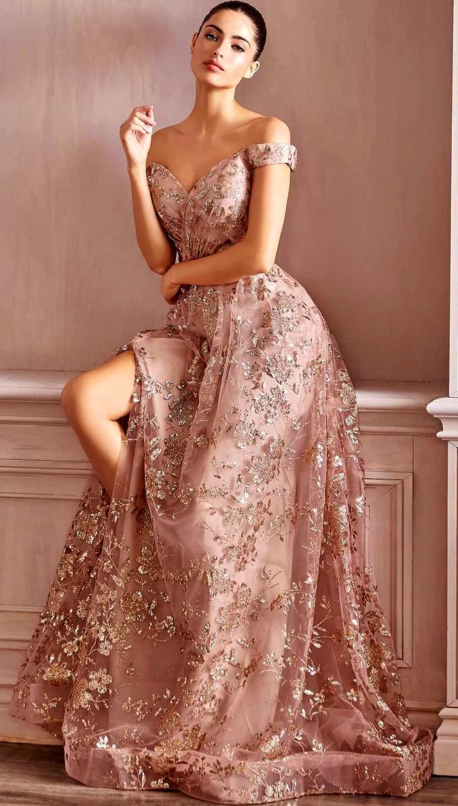
The two pink references offer different decisions. The rear view combines long, relatively quiet skirt panels with a decorated upper section. On the seated figure, lighter branching shapes extend across both bodice and skirt. The base remains pink, but the pattern divides it into smaller areas. If pink appeals to you, compare more than darker and lighter shades. Decide whether you want to see the colour as a largely continuous surface or whether the motif should be a prominent part of your colour plan.
Try a quiet and a decorated candidate with the same small earrings. Begin without a necklace, then add the single piece you actually miss. On the patterned version, jewellery near the face might create a connection; on the quiet version, the same piece might become a second focal point. Either can work if you like the result. Judge the distribution across the complete outfit, rather than choosing several individually attractive objects and assuming that their combination will automatically give the impression you wanted.
Compare pale shades on the garment rather than by name
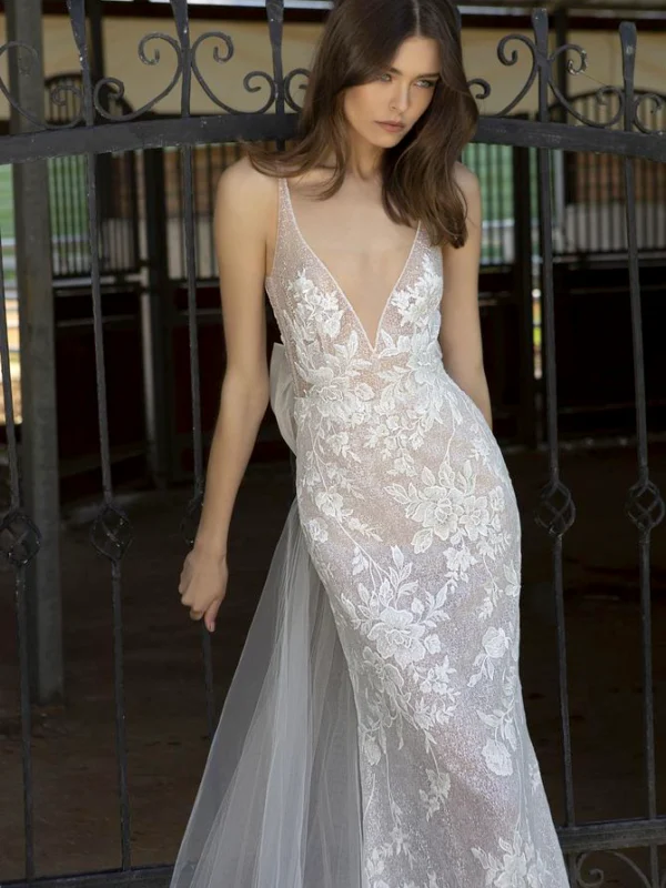
The coastal photograph appears warm and cream coloured, while the dress beside the railing looks pale lilac. Light motifs on the upper sections and lighter outer skirt layers introduce further variations. These descriptions help with an initial search, but make the actual decision through a shared comparison. Different sellers may use the same shade name differently. Bring your existing shoes or intended veil and place them directly beside the dress. Looking at separate screens on different days makes the relationship much harder to judge.
Perfect matching is a choice rather than an obligation. A veil can differ from the dress if you enjoy that transition. Compare its entire visible area, however, rather than holding only a narrow edge against the fabric. Let it fall behind the dress and briefly bring part of it forward. This shows the relationship when the layers overlap. Our boho wedding dress guide offers further whole-outfit questions, while the bridalwear category supplies other silhouettes to compare with your preferred colour direction.
Give several colours a clear order
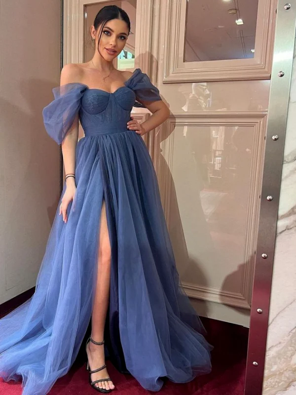
The blue-purple dress sets a different task. Pale blue, darker blue and purple ruffles alternate across the broad skirt, with a patterned area and bow-like decorations above. Here the colour relationship itself is a major focal point. If you like this direction, begin with the ratio of the colours. Should one lead, or should several occupy similar amounts of space? A small accessory in an existing secondary colour can repeat the combination without introducing another colour family. Choose that relationship before searching for more decoration.
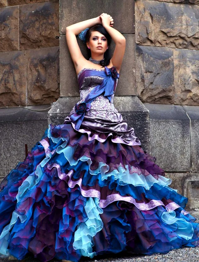
Try two simple shoe or bag options in turn. A quiet dark version can leave the changing skirt areas in charge. A clearly blue version repeats an existing colour elsewhere in the outfit. Judge them with the intended garment rather than beside its picture alone. Consider when the shoes will actually appear: walking, using steps or sitting reveals different amounts. With a long skirt, a simple shoe can be the combination you prefer even if it barely appears in a standing photograph. Visibility and personal preference are useful criteria here.
Bring lighting and your own impression together
The warmly lit rear view is not a reliable specification for an exact pink. The coastal photograph likewise provides no definitive cream colour code. Take a photograph as a direction, and also write down what you like: a warm pale area, a quiet lilac base or a strong shift between blue and purple. You can then ask whether a real candidate offers that particular relationship. This makes it possible to appreciate a dress that differs from the screen while still delivering the overall colour effect you wanted.
Where possible, view the shortlist once in daylight and once under the intended indoor lighting. Use the same surroundings for both candidates. This is a practical comparison, not a guarantee for every later photograph. Ask a companion to hear your observation before offering their opinion. It becomes easier to distinguish your own preference from a general judgement about what should look flattering. Finish by recording your preferred direction and one alternative you would actually accept, rather than retaining an open list of every attractive shade.
Confirm the choice in the complete outfit
Wear the dress, shoes and most important accessories together. Let the skirt move normally instead of only holding it in a wide photographic pose. Check the colour with your veil, bag and jewellery from front and rear. Remove an accessory if it introduces an unwanted additional contrast. Your choice does not need to include every reference idea. A quiet white dress, patterned pink or a clearly multicoloured solution can each be a coherent result when it answers your own initial preference.
Finally, read the care instructions on the actual garment and on each additional piece. The GINETEX explanation of care symbols helps you interpret those labels; similar colours do not establish a shared treatment. Keep the confirmed product information with your selection. Future additions can then be assessed against a real outfit whose colour relationships you have already checked, instead of a collection of separate photographs that happened to look attractive on screen.
Choose a colour family, then compare pattern and accessories on real garments. A photograph provides a direction rather than an exact shade.
Frequently asked questions
Should I choose colour before silhouette?
A provisional colour family helps, but make the final decision in your intended silhouette: a small sample cannot show the effect of a large skirt.
Does a coloured dress need bold jewellery?
No. Begin with the dress alone and add one accent. Dense decoration on pink creates a different starting point from a quiet white surface.
Can the outdoor photograph identify an exact cream shade?
No. Lighting, photography and screens affect the impression. Compare the actual dress and samples together.