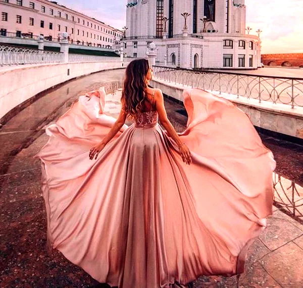
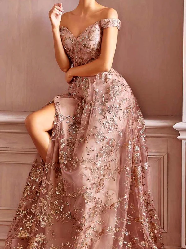
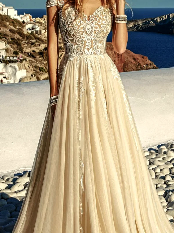
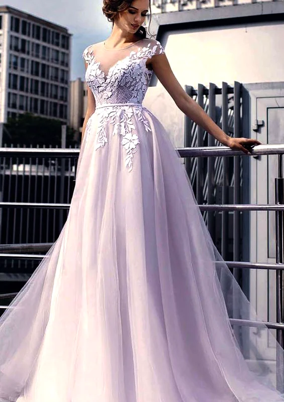
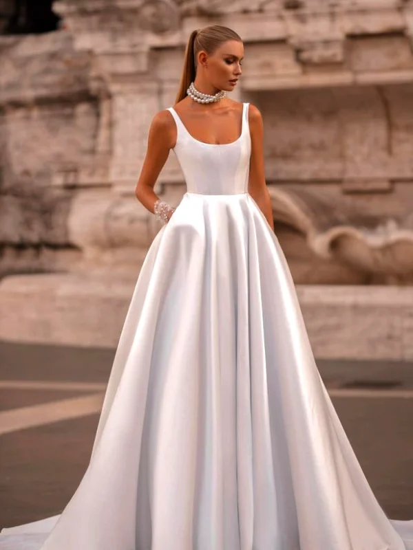
Bridal colour comparison helps separate the size of a coloured area from the decoration across it. The lifted pink skirt creates an expansive surface. The other pink dress divides its base with many lighter branching motifs. The warm pale coastal look and light lilac dress each place a pale foundation beside a more visibly patterned upper section. The white strapped dress lets folds and silhouette carry most of the visual interest.
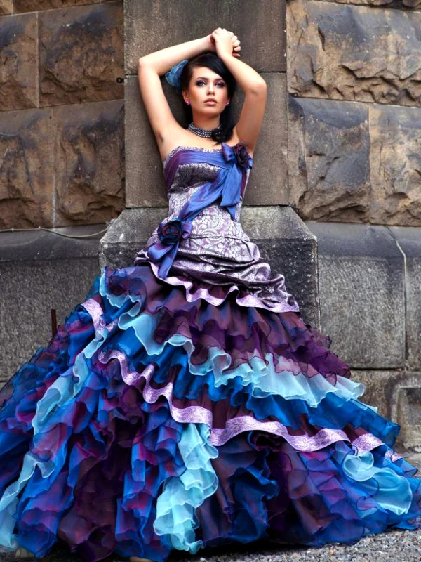
The blue-purple alternative adds a different task. Several colours alternate through the ruffled skirt, while upper decorations repeat individual shades. Here you can decide which colour should lead before choosing shoes or jewellery. With the quieter examples, the question is more about how prominent you want an additional accent to become. One accessory strategy need not suit every reference.
Choose two pictures with different jobs and describe your preference concretely. A photograph cannot supply a binding colour specification for an actual garment. Compare real pieces together under the same conditions and also look at the skirt falling normally. An extended photographic pose reveals an additional colour area, but not every state during wear. Use that distinction to turn attractive references into decisions for your own outfit.