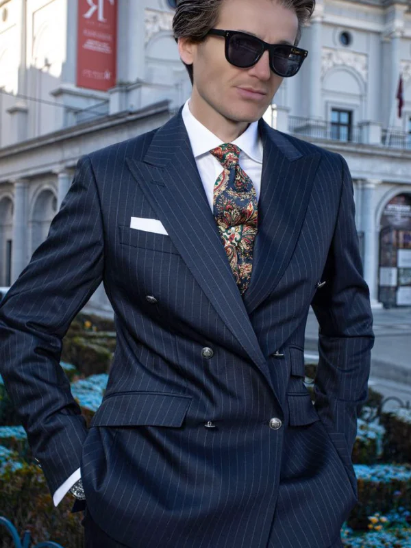
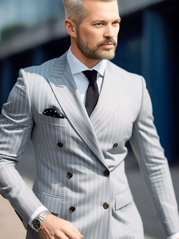
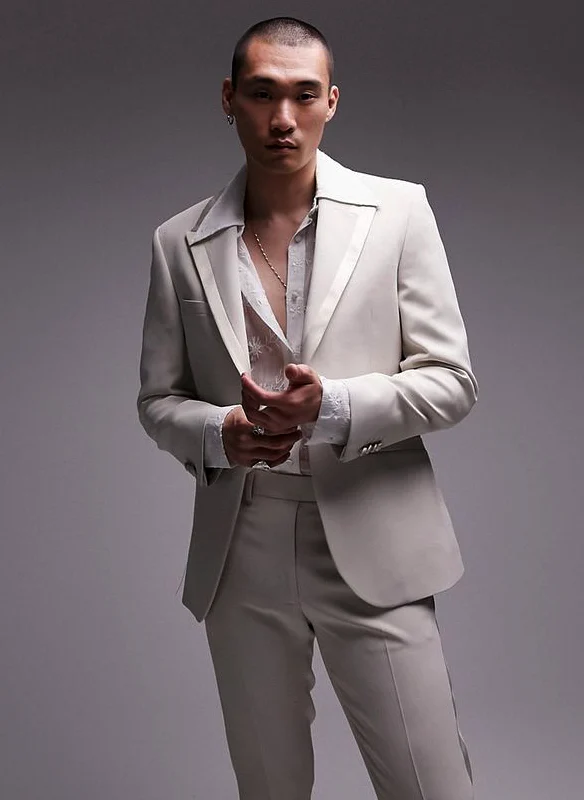
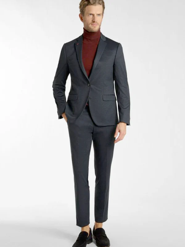
When you compare jacket fronts, these pictures show different relationships between lapels and centre. Fine dark stripes frame a larger colourful tie pattern. The paler striped jacket instead uses a quiet dark neck area and another small pattern at the upper pocket. Two further references open the shirt more widely or visibly replace it with a turtleneck. Their quieter, single-breasted-looking fronts provide a deliberate alternative to the overlapping arrangement rather than another example of exactly the same jacket.
Choose a front first and a neck solution afterwards. You can enjoy the colourful tie while seeking different stripes. An open shirt area need not remain attached to the particular pale jacket in the photograph either. Describe both preferences separately and try them together using actual garments.
Compare with hands free and add complete trousers and shoes. The upper crops cannot settle the hem decision. Have the real jacket’s intended connection demonstrated, adding square and smaller details individually. Each reference can then explain a clear difference instead of merging four outfits into one supposedly compulsory collection of pieces.