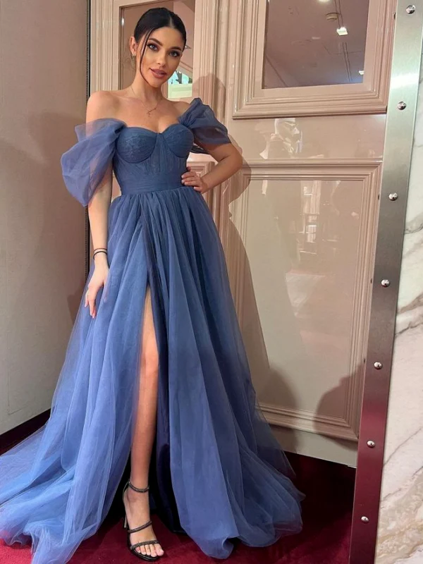
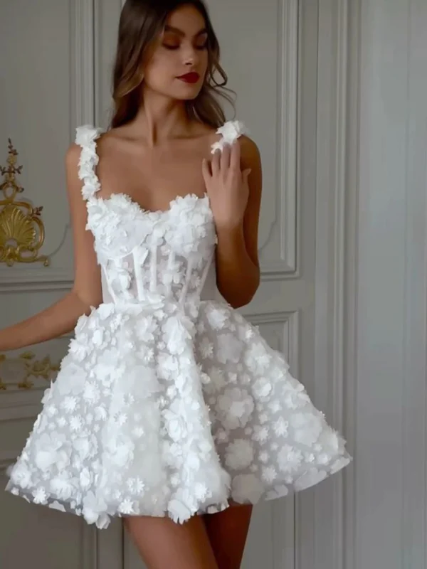
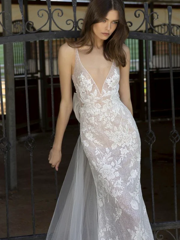
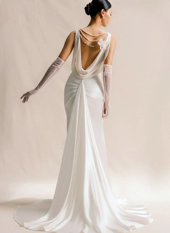
A monochrome bridal look starts with a colour direction intended to connect the dress and its main companions. You might prefer pale tonal variations or make a strong colour such as red central to the outfit. What matters is which pieces should visibly belong together and where small differences are deliberate. These four pictures offer different starting points: a pale rear view with gloves, a long red dress, a slim pale shape with a veil and a black-and-white long-sleeved view. Use them for your own colour arrangement without assigning a ceremony or shared product range to the images.
1. Give a monochrome bridal look its colour direction first
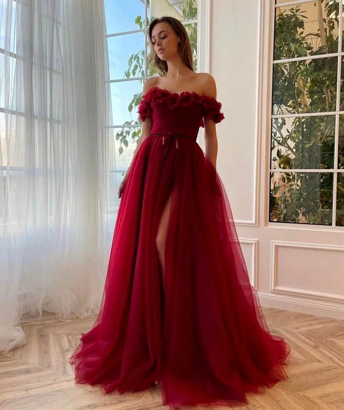
Decide which colour should occupy the largest area overall. In the red example, the strong tone defines both the upper section and the broad lower surface. Floral shapes at the top edge, a narrow waist tie and the full skirt stay within that visible direction. In a pale outfit, several neighbouring shades may appear across dress, veil and gloves instead. Decide whether you seek a very close match or deliberately enjoy an identifiable variation within one colour family. Neither preference needs to be treated as the only possible way to build the outfit.
Write the choice as a specific task before selecting further pieces. For example, a pale dress with a lighter-looking veil, or a strong red dress with quieter companions. Bring actual candidates or suitable swatches together to the fitting. Separate screen pictures viewed on different days explain their relationship only to a limited extent. Choose two or three important components initially and leave further accessories out. This isolates the shared colour direction instead of turning several changing shapes and points of shine into one decision that is difficult to explain or repeat.
2. Connect similar colour with different surfaces
The pale rear view places a large quiet dress surface beside long sheer-looking gloves. Both occupy the light range without appearing equally dense. The deeply draped back also leaves open space between face, shoulders and fabric. For colour coordination, the useful comparison concerns how the gloves look beside the dress. Assess both on the body rather than only folded on a table. The visible area and the background behind the glove belong to the impression you are actually choosing, helping connect a small colour sample to the complete worn arrangement.
A monochrome bridal look can retain those differences deliberately. A quieter dress surface does not have to be completed with companions of exactly the same shine. Try the dress shape alone first, then add gloves or another intended piece. Examine the hands beside the skirt and in front of the middle. You might enjoy denser fabric beside a lighter glove effect or prefer another finish. Describe that relationship as a visible preference, asking separately about composition and fit on the actual product. Colour coordination does not replace those questions, but it helps keep the fitting request specific.
3. Treat the veil as a large additional colour area
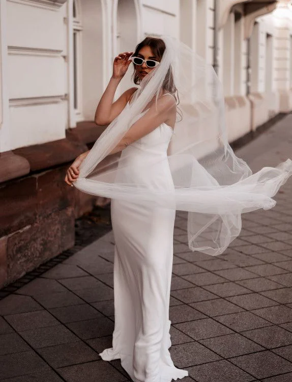
The sunglasses photograph has a long pale veil held across the front and side of a slimmer pale dress. It introduces a substantial light-looking area beside the comparatively quiet silhouette. For your own outfit, inspect the veil spread out first and then in its intended wearing position. Do not hold only a small edge sample against the dress. Compare the complete proposed length so you see how much area the layer adds and which parts it overlaps. Two individually appealing pieces can create another arrangement when they are actually worn together.
Let the veil fall normally afterwards and view front, side and back. The sideways-held pose is an additional view rather than the only state of your eventual outfit. Try another tonal option under the same conditions if uncertain. Our boho wedding dress guide adds questions about the complete combination; the crochet-look bridal guide supports thinking about visible pattern and underlying surfaces. Transfer individual questions to your selected colour direction without needing to adopt another style idea in full. The comparison remains grounded in the pieces you plan to wear.
4. Distinguish small accents from the main colour
Several pale bead-like strands sit above the draping in the rear view, with a floral element at one shoulder. Their size and shape differ from the large fabric area. The sunglasses in the veil picture introduce a pale frame and dark lenses too. Decide whether smaller accents like these belong in your personal colour arrangement. A monochrome bridal look need not require every fastening, jewellery point or visible interval in a picture to look identical. Establish your own intended boundary for additional contrast before copying a complete accessory combination from one photograph.
Add jewellery individually and inspect it on the actual dress. A fine chain, larger pendant and earrings occupy different amounts of space. If you enjoy the rear strands, check them with your hairstyle and any planned veil. Visible pale rounded shapes do not establish genuine pearls; request composition and attachment information for the offered version. Your initial styling question can remain specific: do you want those narrow pale lines in the complete view, or should the large quiet surface lead more strongly? That chooses an appearance without using an assumed material as the reason.
5. Separate a shape reference from an exact colour reference
The black-and-white picture shows a pale long dress with a straighter neckline, long sleeves, defined waist and broader lower outline. Its sleeves and substantial skirt area can describe a preference for a quiet continuous silhouette. The actual white shade cannot be determined from this photograph, however. Use it for shape questions and add real colour samples when seeking a similar model. This keeps clear which information the picture provides and which still needs checking on the garment, allowing you to explore a liked sleeve or skirt line in an actual available colour.
The red alternative has another task. Its strong colour direction is visible, but it does not show a complete arrangement of dress, veil, shoes and gloves. Try appropriate companions separately. You can enjoy the upper floral edge while keeping the rest of the combination quiet. After each addition, ask whether the large colour field still looks as intended. A clear base can support different amounts of extra structure; what matters is having seen the chosen distribution in your own complete outfit rather than converting colour preference into an automatic list of accessories.
6. Confirm the shared colour direction in the final fitting
Bring the intended pieces together and inspect them under the same lighting where possible. Check front, side and back with finished hair or a sufficiently similar arrangement. Move your hands, walk and sit. A monochrome bridal look should still show the colour relationship you selected after that sequence. Record deliberate differences and the pieces you actually want replaced. A precise description such as quieter shine or a closer pale tone supports the next fitting more usefully than asking everything simply to match, keeping the reason for a change attached to an observable quality.
Treat each actual piece according to its own information. Dress, gloves and veil may have different care instructions even when they are meant to belong together in colour. The GINETEX care-symbol explanation helps interpret labels; pale colour and similar appearance do not establish one shared treatment. Record the confirmed outfit in full afterwards. Your choice then connects the preferred colour family to surfaces and accents you have really compared, rather than assuming an exact match from separate photographs. The record can also guide which relationship to retain when adding another piece later.
A monochrome bridal look uses a chosen colour family to connect pieces while allowing different surfaces and deliberate small accents to remain visible.
Frequently asked questions
Do all pieces need exactly the same shade?
That is a styling choice. Compare actual pieces together and decide whether slight tonal differences are welcome or a closer colour relationship is your aim.
Can a red dress be the starting point?
Yes, if that is the colour you want for your own bridal look. The red reference supplies a colour and shape idea without establishing a wedding role or tradition.
Does the black-and-white picture show the precise white shade?
No. It shows lightness, lines and surfaces but cannot establish the garment’s actual colour accurately.