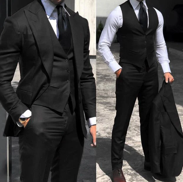
A pale shirt centre stands out against darker neighbouring areas in this double view. The tie makes a vertical line from the neck downwards. The waistcoat opening limits the shirt at the sides, with open jacket lapels beside it on the left. On the right, shirt sleeves appear as larger pale areas too. Describe which boundary appeals first. The photograph does not establish that every pictured piece belongs to the same particular product offer.
For your own comparison, keep the neck accessory unchanged initially and inspect the shape between collar and waistcoat edge. Would you like the pale area narrower or broader? Try this with actual garments without artificially arranging the shirt for a picture. A hand in a pocket changes front tension, so include a view with both arms relaxed down.
Check cuffs afterwards. They repeat the pale centre in smaller areas. Test the boundary beside your watch and while reaching. This lets you assess a clear colour-and-area idea without deriving a dress code, fibre or production process from the dark appearance. Choose the actual shirt tone in shared light.