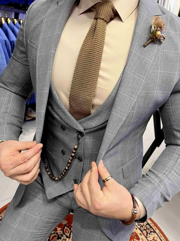
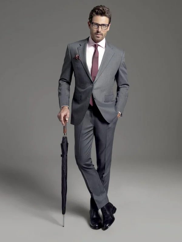
Tie comparisons reveal different relationships with the surrounding outfit here. The closer grey combination places a brownish textured surface beside a warm pale shirt. The grey striped full view uses a reddish tone against a pale pink shirt instead. Both help compare the inner colour group before its drawing. The remaining main pieces need not be changed continually for that initial decision.
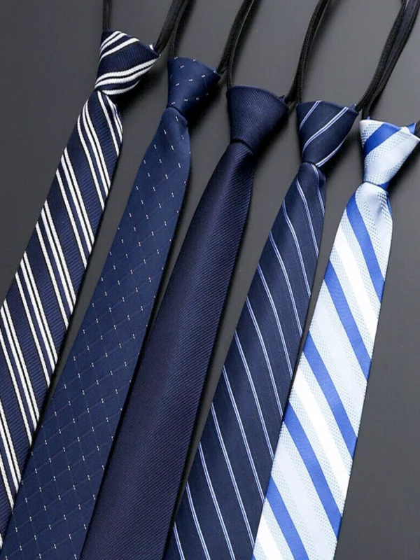
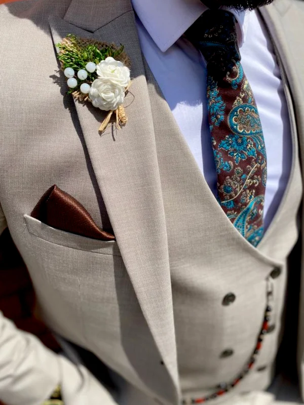
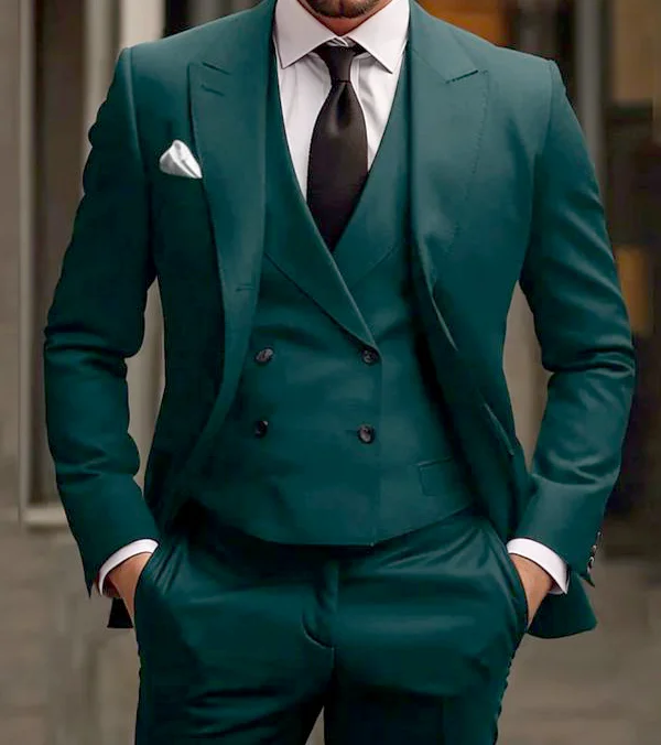
The blue tie row offers its own comparison between quiet dark surface, small points and diagonals of different widths. The beige-grey crop adds a multicoloured curling pattern, dark square and pale lapel decoration. In the green outfit, the tie stays quieter while the additional waistcoat occupies considerable space.
Choose two roles rather than two complete outfits from the selection first: perhaps a warm textured accent and a quiet dark contrast. Try the ideas with the same shirt. Add the square afterwards and view every position from conversation distance. You can decide which colour to repeat and which area should remain independent. Establish composition and care separately through the actual items rather than treating the photographed surface as a product specification.