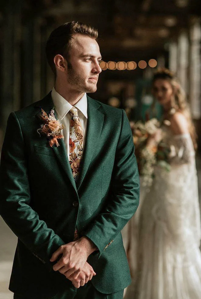
The lapel flower makes a prominent warm accent beside a large floral-patterned tie on the green jacket. The shirt is white and hands rest together at the front. A square is not clearly visible in the pictured chest area. A blurred pale-clothed person appears behind; their role and the actual event are not established. The useful styling comparison is the distribution of two visible upper-jacket details, rather than an assumed occasion or a material identification for the flower. Compare your own pieces together instead of treating the photograph as an exact colour chart.
Fit a planned lapel flower without an additional square first. Look with the actual tie and decide whether each retains its own space. Add only a small square edge next to assess whether it contributes a wanted colour or makes the chest too busy for your taste. With a prominent flower, a restrained fold can differ from a broad puff. That comparison needs the real pieces on the same jacket. Do not copy every warm colour when you mainly want to assess one lapel accent’s position; try reducing the exposed square as well.