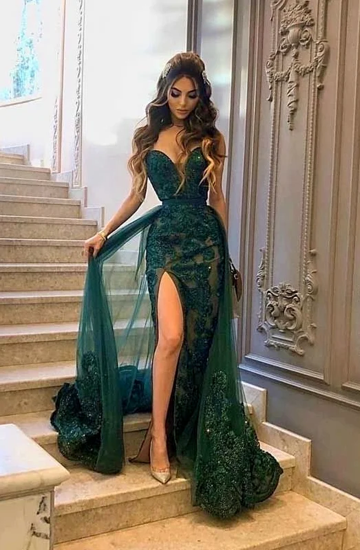
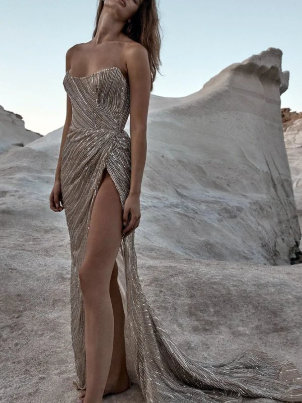
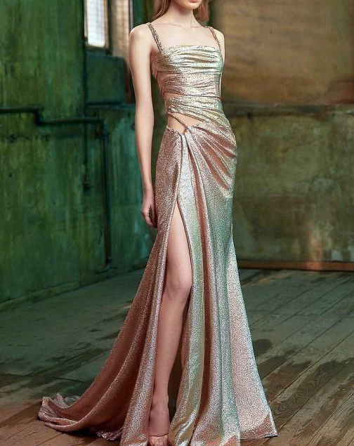
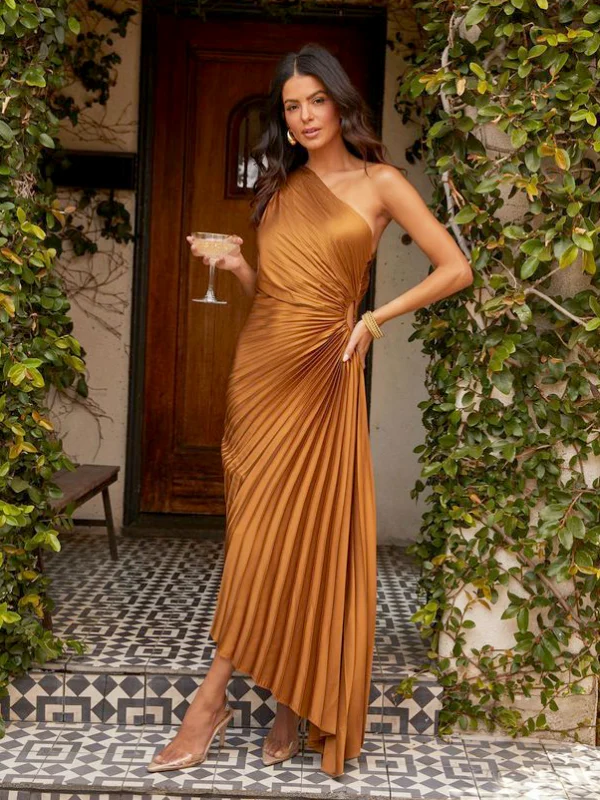
Compare gold tones by beginning with the broad colour areas of these four views. The long finely strapped shape looks paler and golden, with a broader reflective waist accent. The strapless version shows a more muted warm impression through many narrow curving lines. Rosy and paler areas sit together on the other strapped outfit. The one-shoulder folded dress adds a warm ochre impression and another lower length. These photographs are neither uniformly lit colour samples nor material evidence. Use each to describe the direction you would like to find.
Guide to comparing these images
Compare colour areas and visible boundaries
Choose two approaches you want to recognise in an actual offer. Compare real garments or confirmed samples in the same place where possible. Add an existing bag and jewellery piece before seeking further additions. Do you enjoy the warm base colour or the more distinct surface? Answer separately. A colour idea can appeal while you seek another neckline or hem. Record preferred tone and shape in two sentences. They remain understandable when another offer does not reproduce every detail of the original photograph, turning the search into more than a collection of similar colour names.
Place the longer V-front beside the strapless-looking line-covered dress first. The broad waist accent in the first image forms a clearly bounded area; many narrow reflective lines spread across larger zones in the second. If choosing only the base tone, leave the desired quantity of lines as a separate question. Another candidate may connect a similar colour direction with a different distribution, provided its actual shade is checked too.
The rosy reference and warm one-shoulder dress add different openings and lengths. Parts of the head and footwear are outside the rosy image, whereas shoes and an uneven hem are clearer in the ochre example. Avoid deriving a complete accessory choice from the first crop. Compare both real dresses with the same shoes and a similar stance. Record whether colour, reflective pattern or lower length actually decided your preference.