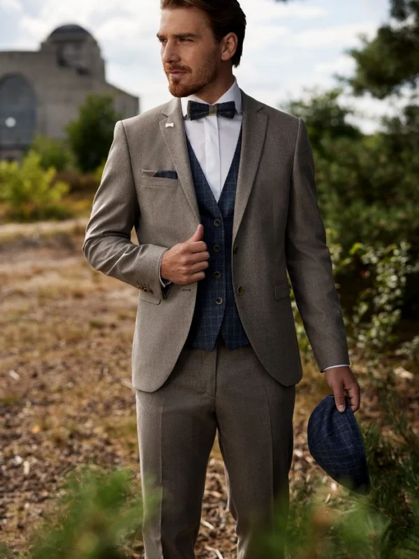
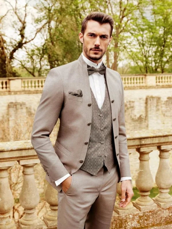
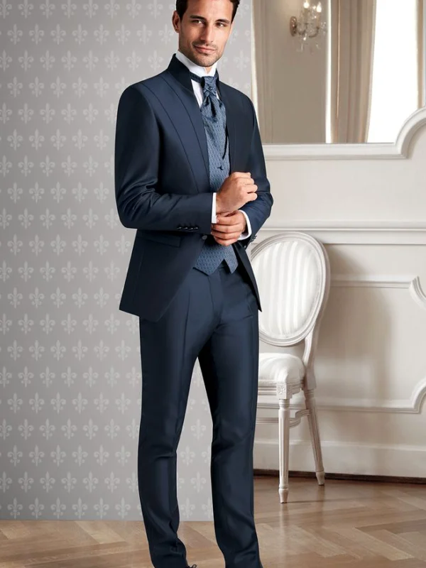
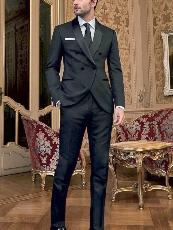
Waistcoat panels differ here through colour, pattern scale and the jacket framing them. Grey-brown surrounds a dark checked-looking inner surface, while the pale suit uses a smaller pattern closer to its own lightness. Blue adds a tonal option with a differently drawn inner area and longer tie. The black overlapping front explicitly provides a comparison without a visible waistcoat, rather than a fourth waistcoat example. You can assess the contribution of the extra surface against a different front idea instead of assuming every image makes the same point.
Choose the intended difference within an actual suit first. Compare a darker and a closer colour field with the same shirt, then consider bow tie or long tie. The cap held in the grey-brown picture is a separate addition; repeating a pattern does not require adopting the accessory. A neutral view without hands at the front helps compare the blue lines. Add pocket square and other small pieces individually. Each picture then contributes a concrete outfit question rather than a broad claim about luxury, price or workmanship.